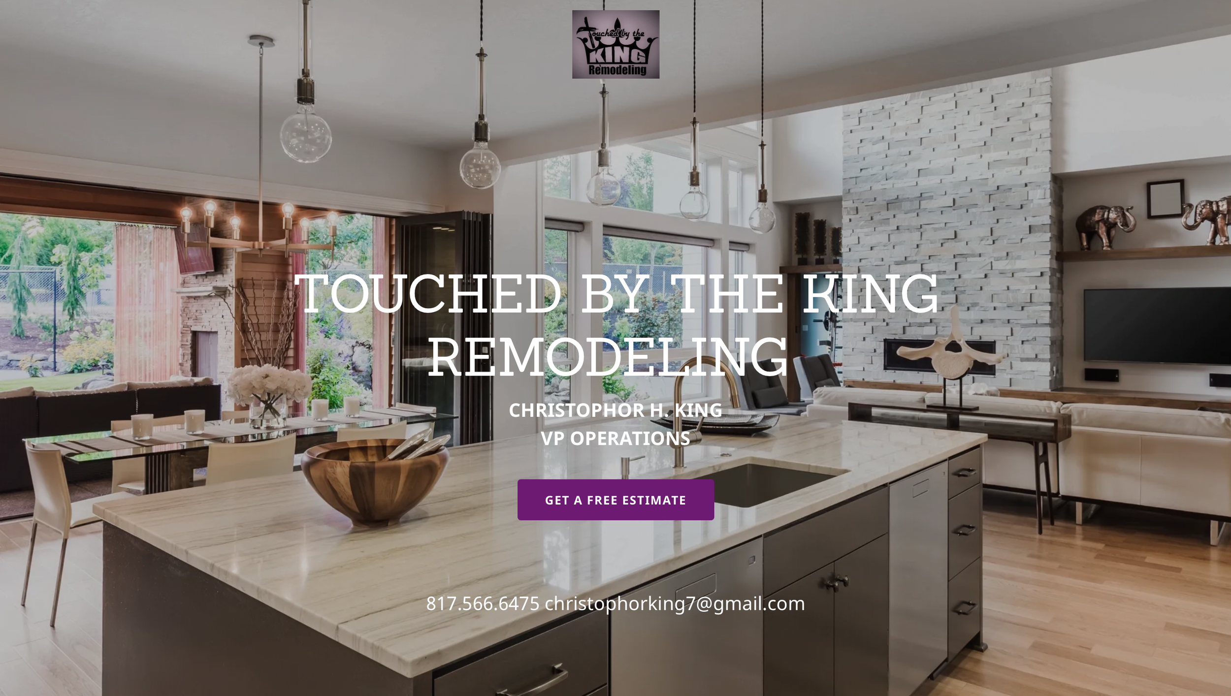
TBTK Design & Build Website Redesign
A remix on a family-owned remodeling business brand and website.
My client's users had difficulties navigating his company website and understanding the services they offered.
Dream.
Define the audience, discuss goals, and potential risks.
Define.
Begin building a rapid prototype for testing.
Develop.
Test rapid prototype for functionality feedback.
Deliver.
Present to the client for final approval.
The Overview
The Team
I worked as the sole designer on this project.
The Roles
Company Analysis
User Research
UX Design
UI Design
Prototyping
Usability Testing
The Tools
GoDaddy
Figma
Adobe Suite
Google Suite
Canva
The Project Requirements
The current design is straightforward, but difficult to navigate and understand.
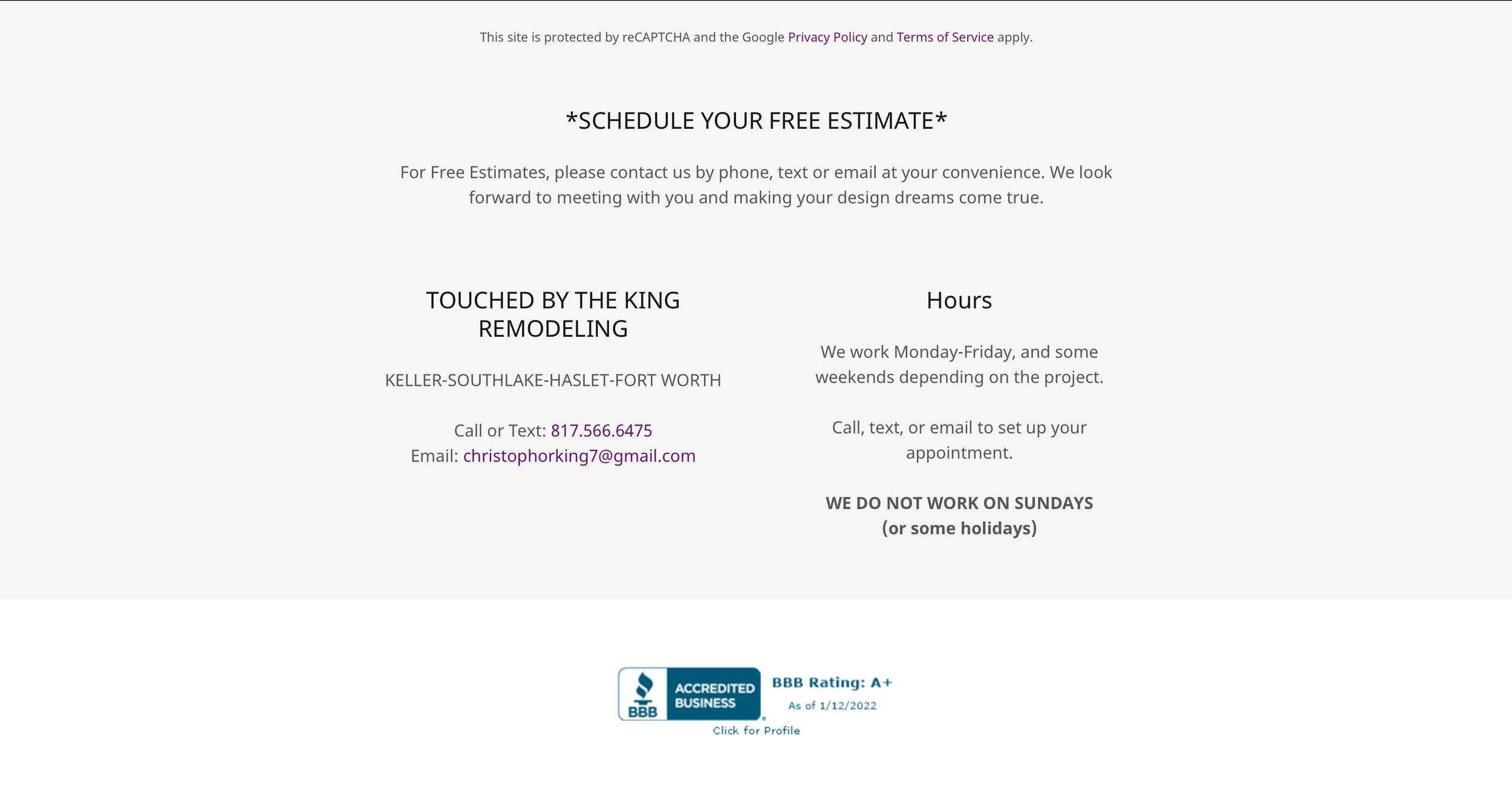
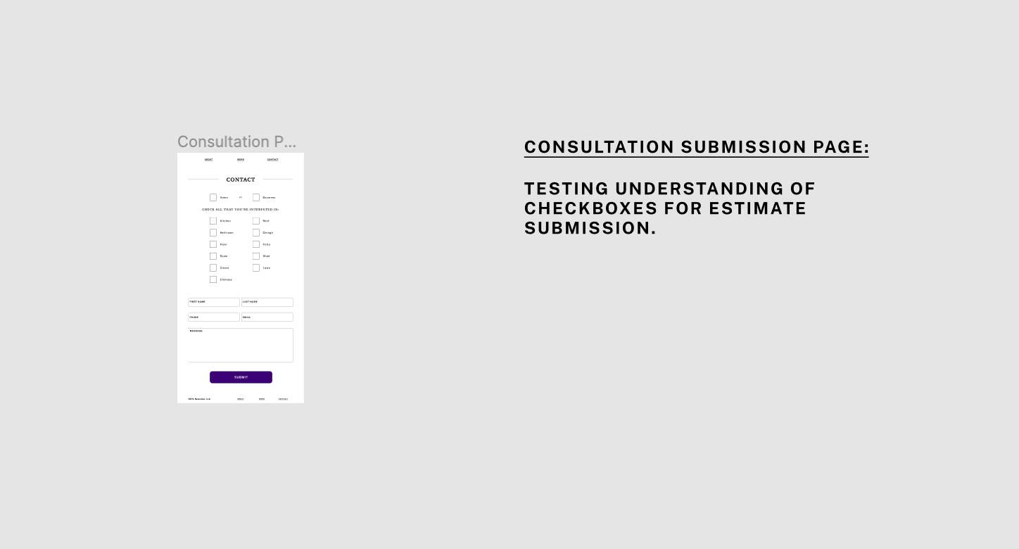
The addition of a navigation menu and separate contact submission page was among the opportunities first noticed.
Phase One - The Research
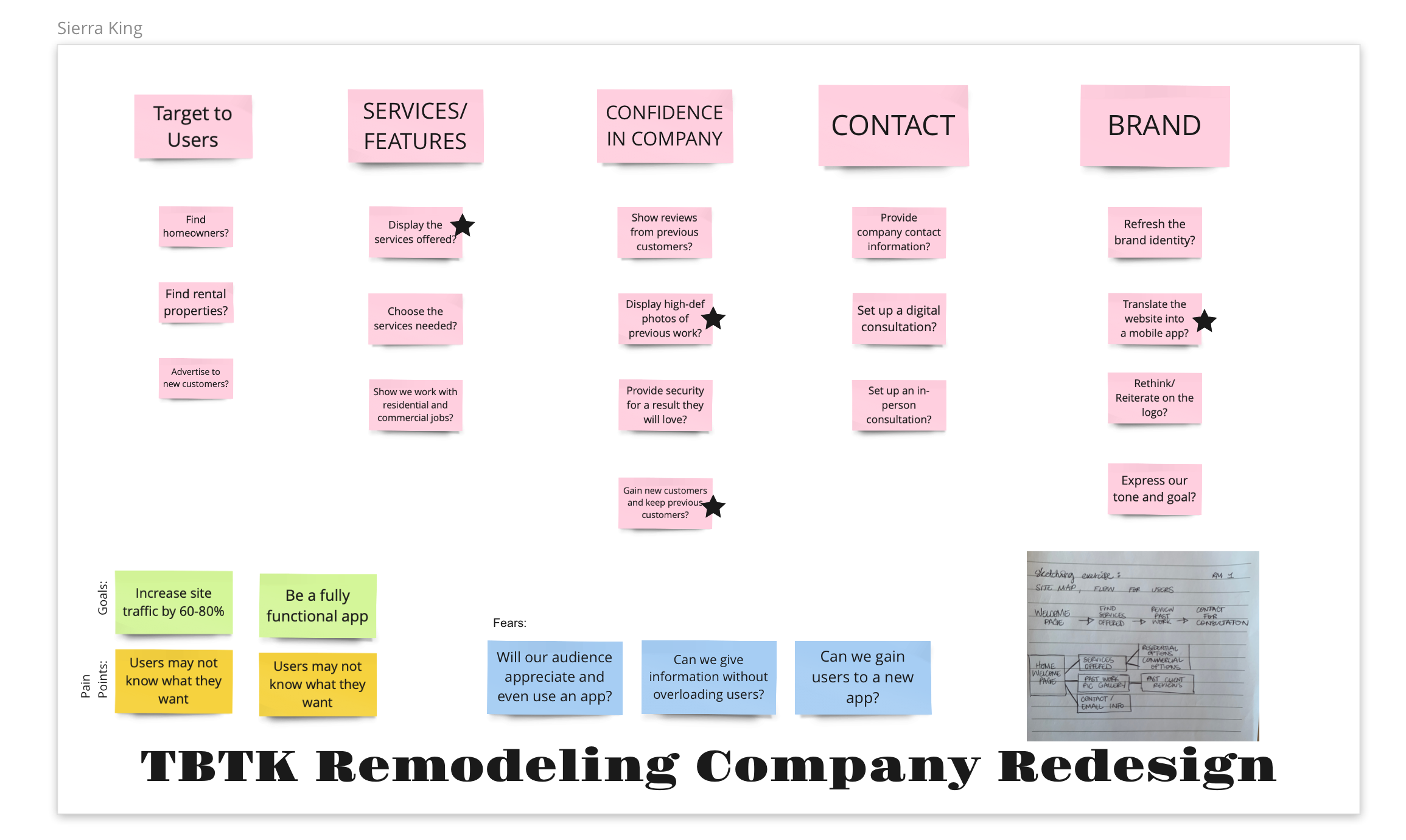
An understanding of my client's users was essential.
I needed to know who would be using this site and what they would be looking for.
Company Analysis
I began by looking at the existing data on the company.
Achievements
Respected for 10+ years
32 years of overall experience
Better Business Bureau rated and vetted
Motivations
Refresh homes and businesses alike
Provide a beautiful and functional space for family or work
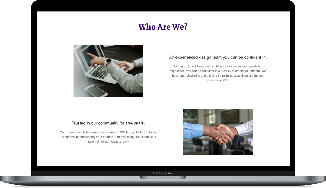
Identity
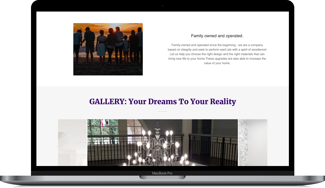
Family-owned and run since the beginning
Integrity, Trustworthy, and 100% customer satisfaction
The Survey
I created and conducted surveys with my client’s current customer base to gain insight into their routines, demographics, motivations, and pain points. This gathered information tells me what services my client's customers expect to find.
What services are the most popular among homeowners?
The majority of jobs completed is clearly organized from highly requested to least:
Kitchen, Bathroom, Flooring, Office, Closet
Completed Projects
Current Customers
4 out of 5 jobs completed are residental projects.
- Residential
- Commercial
- Residential
- Commercial
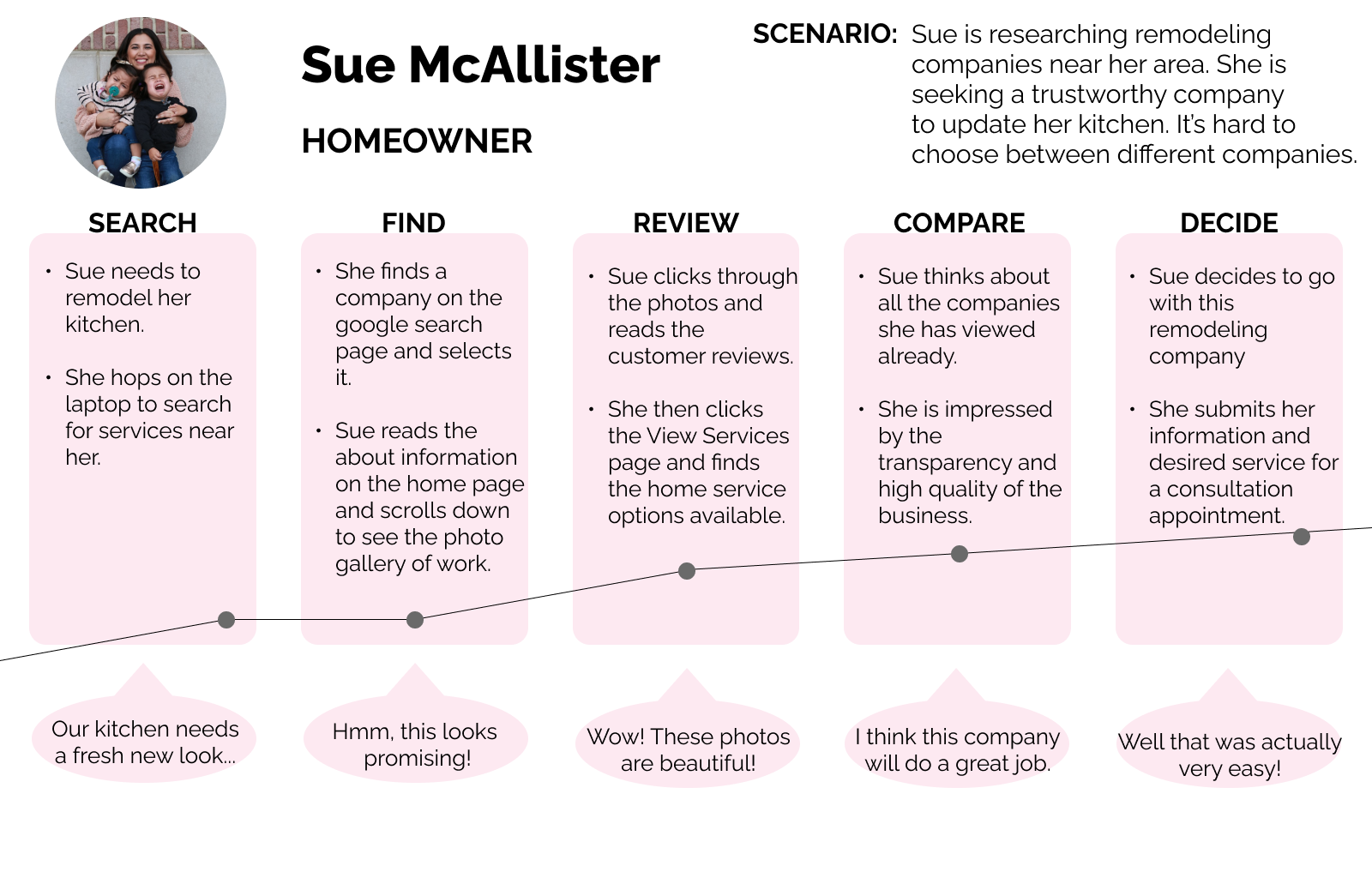
The Interview
I conducted in-person and remote interviews with participants who had hired a company to assist with a home project.
I interviewed with my client’s previous and current homeowning clients - ranging in age from 31 to 64.
Key User Insights
Based on the information gathered from the customer’s experiences, I was able to determine the expectations they have when seeking a design job, and how to improve their experience.
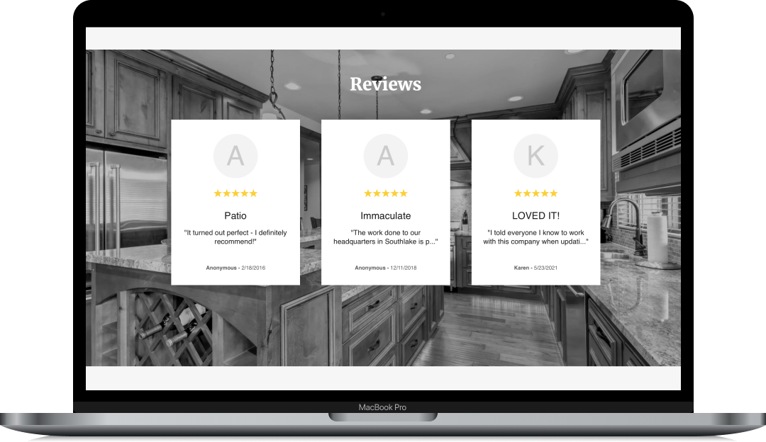
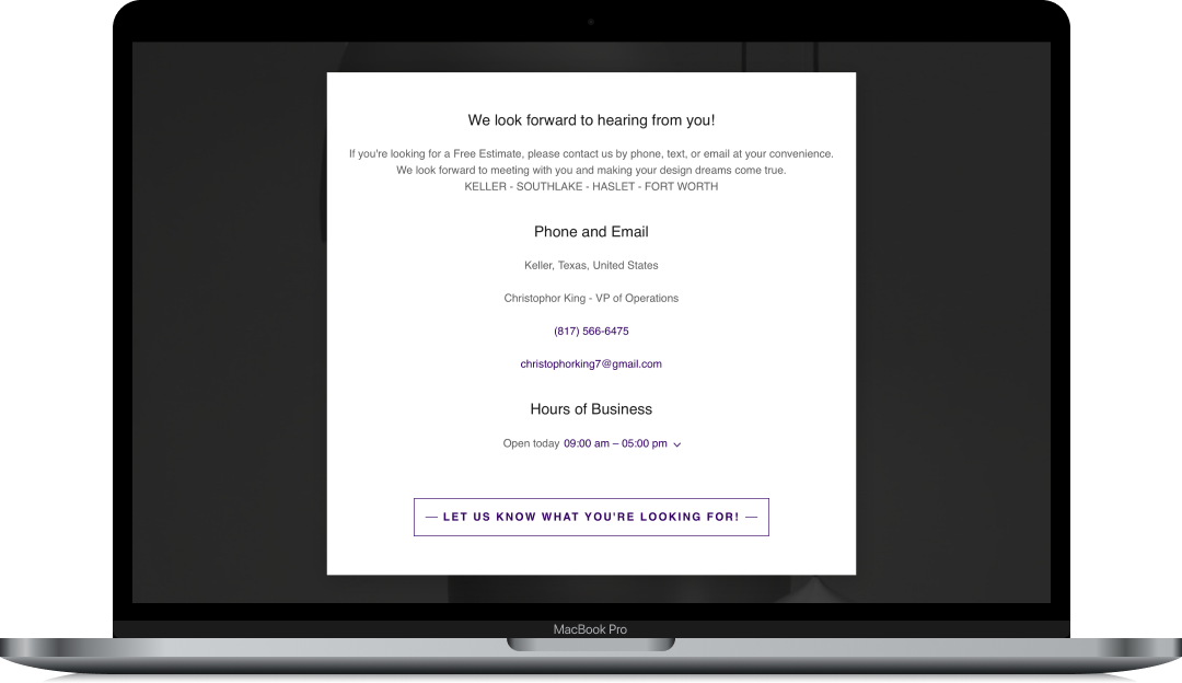
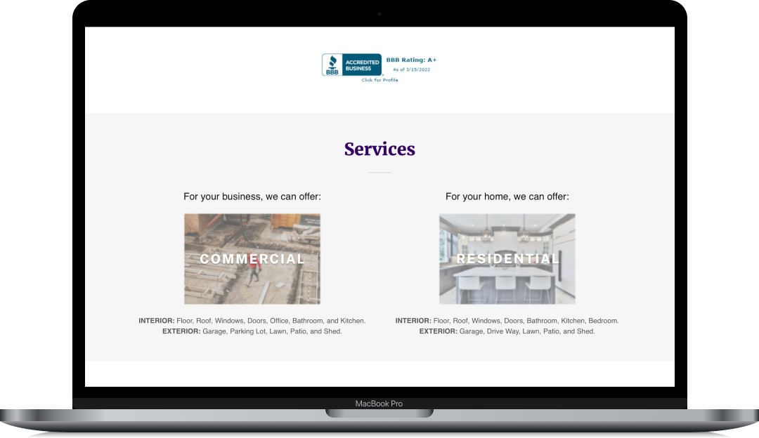
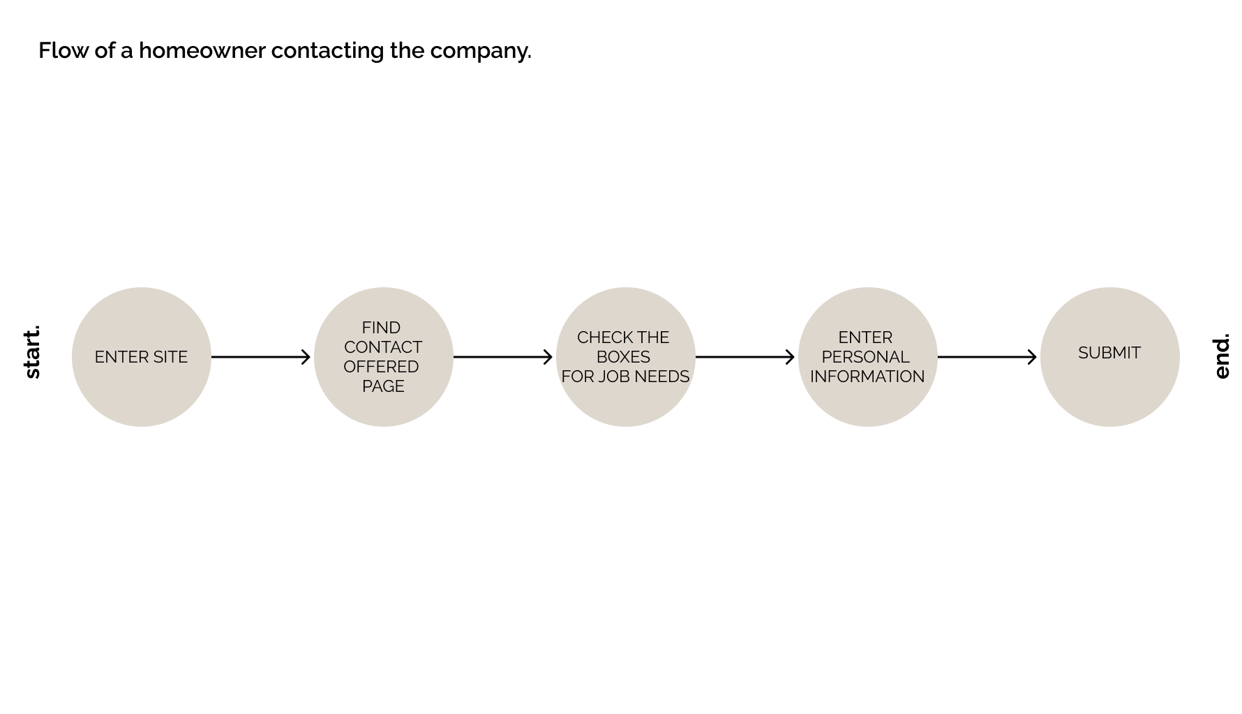
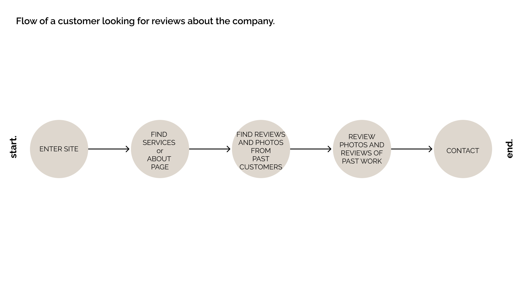
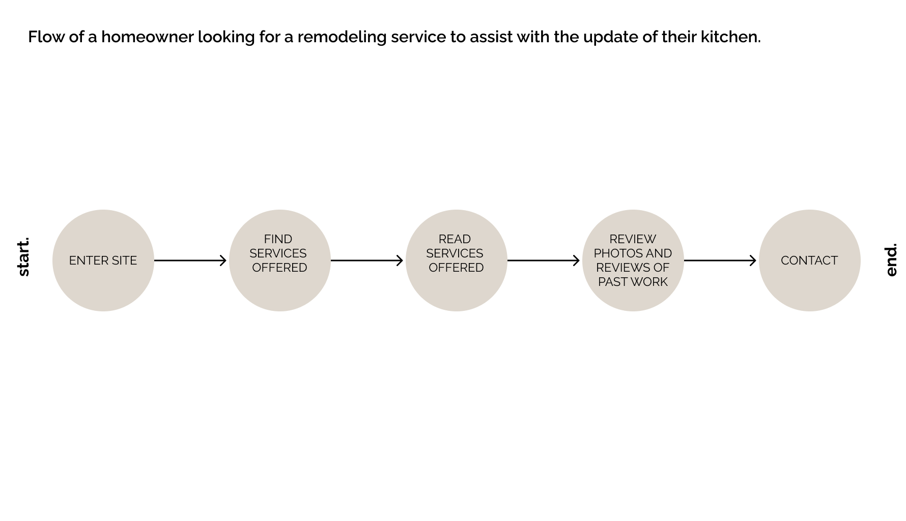
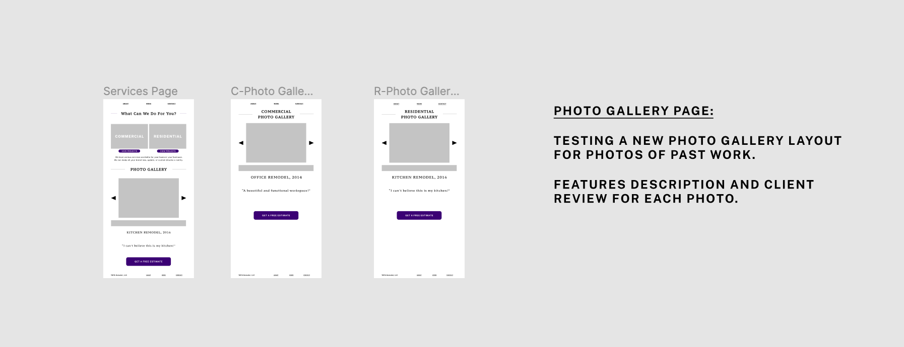
I determined the user’s need to easily find and view the services offered by the company. They will need to be able to easily contact the company with their remodel or construction needs. They need to easily find and view past reviews and company ratings.
Personas
From my surveys and interviews, I found patterns demographically and motivationally in my client’s customer base.


Phase Two - The Design
This initial research, combined with the existing company data, gave us three User Stories to focus on for the MVP redesign.
User Stories
The user’s need to easily find and view the services offered by the company.
The users need to be able to easily contact the company with their remodel or construction needs.
The users need to easily find and view past reviews and company ratings.
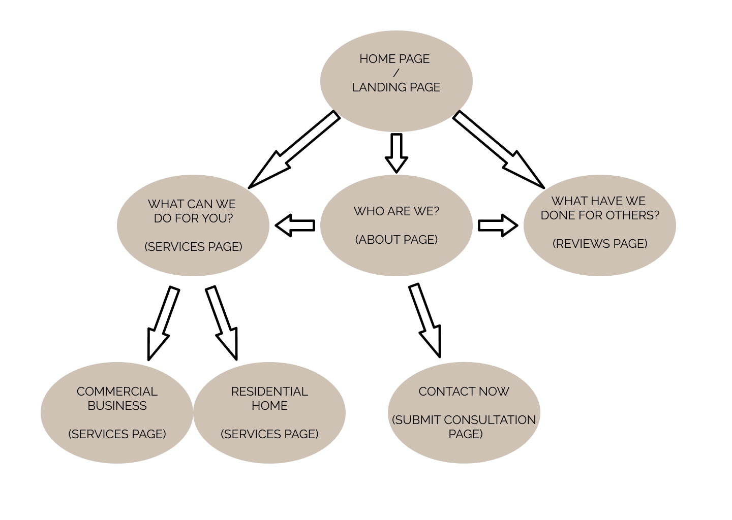
User Flows
The User Stories I found from researching the customers became the base for my User Flows that would dictate the content and layout of the new website. I placed myself in the place of the user and thought out step by step how I could accomplish this process.
“As a homeowner…”
Sketches
Next, I started developing my solutions on paper: sketching out all the potential ways I could lay out the information and optimize the users experience when deciding which company to hire.
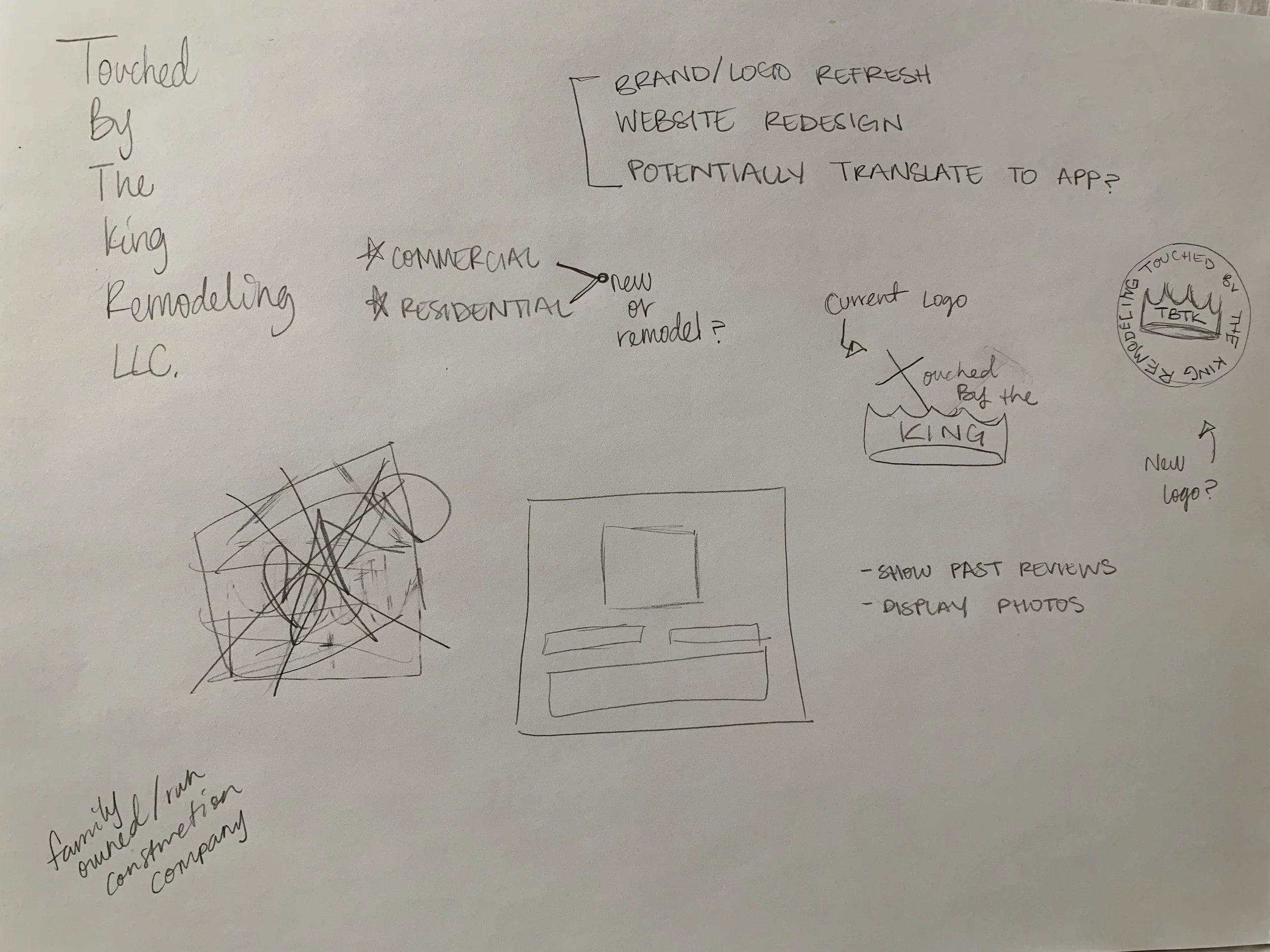
I worked out a few ideas related to the branding and set up a content map for the site navigation.
Notes
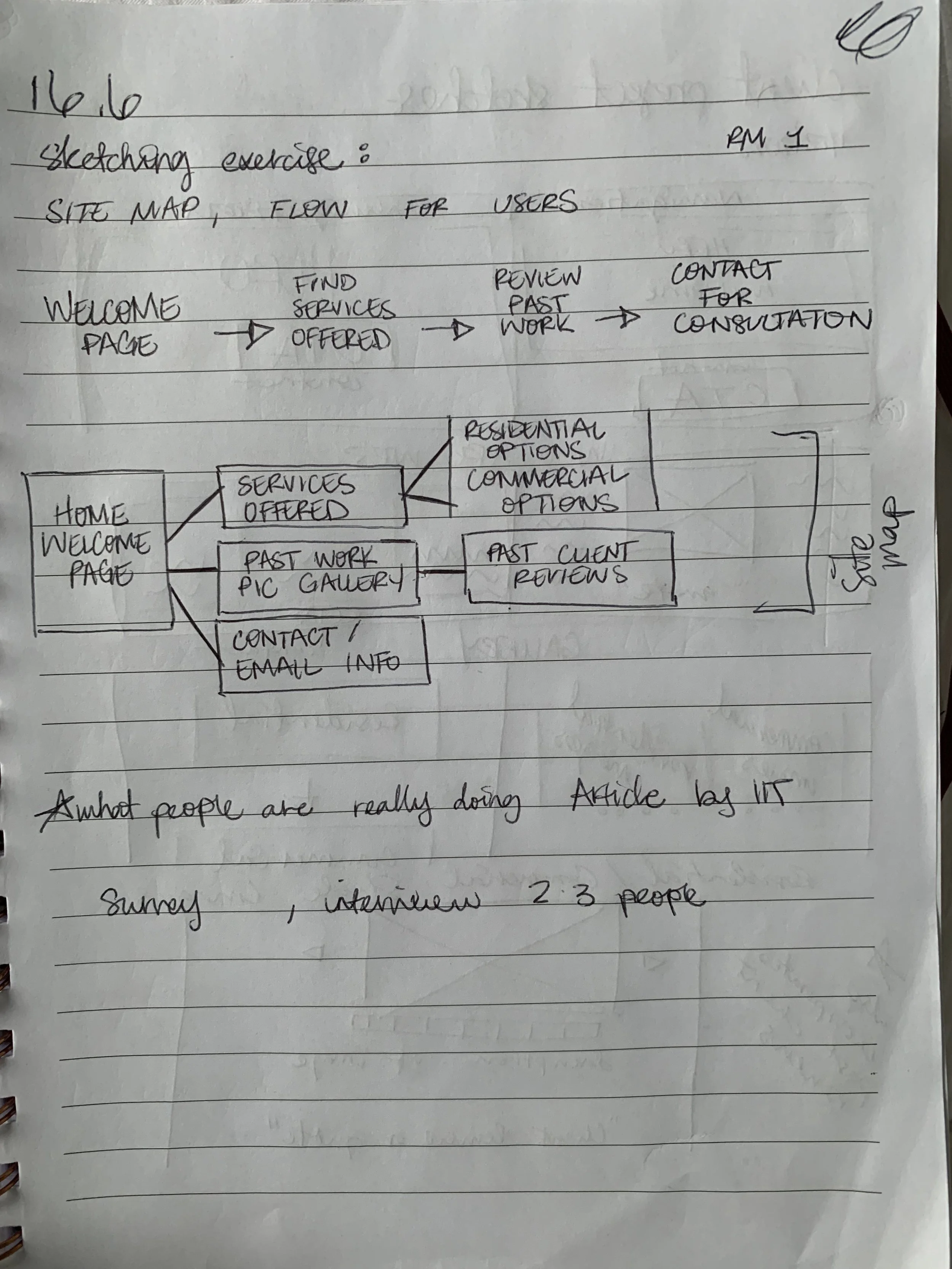
Site Map and Ideation
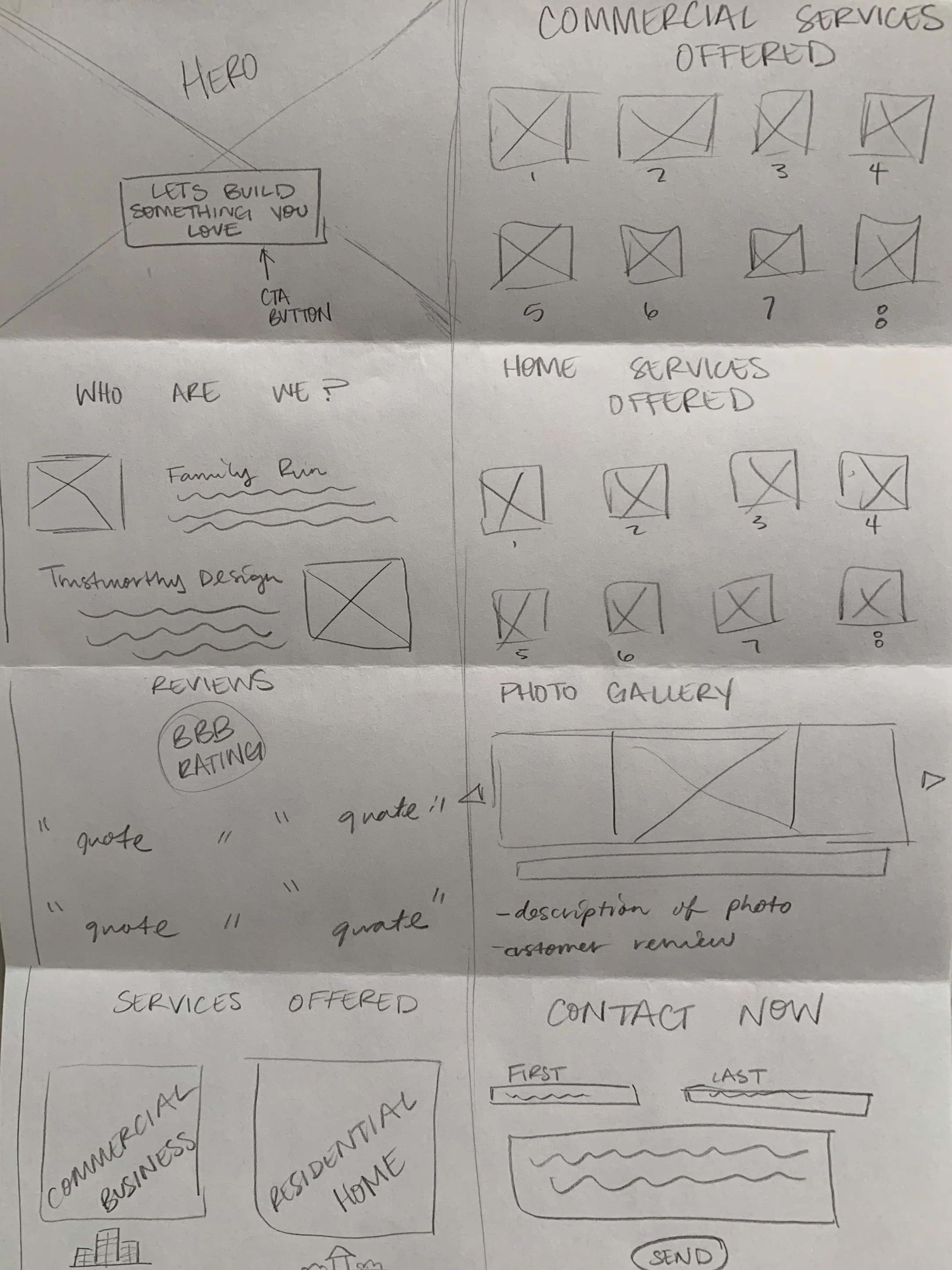
Sketches of Desktop Screen Layouts
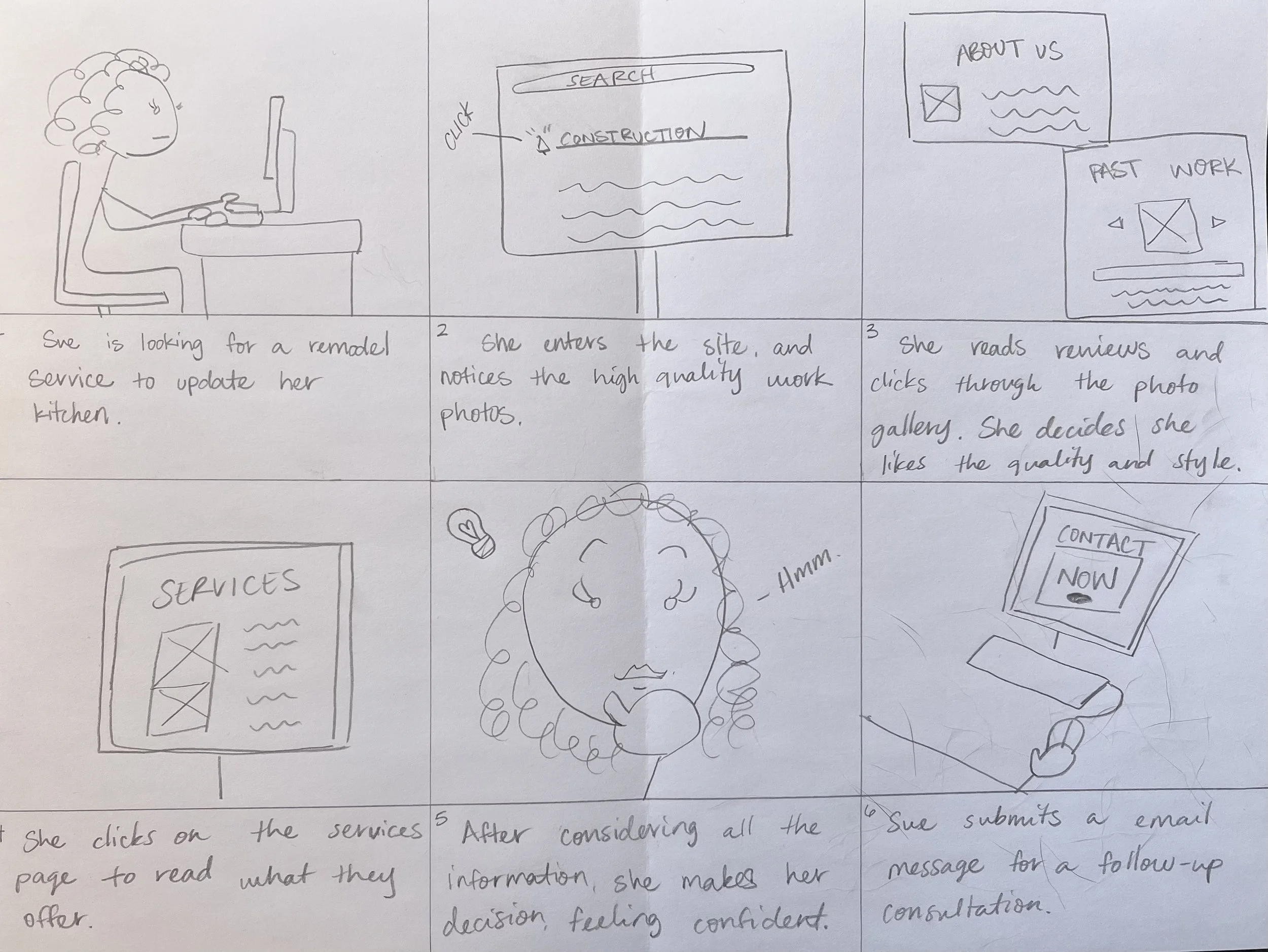
Storyboard Sketch
Wireframes
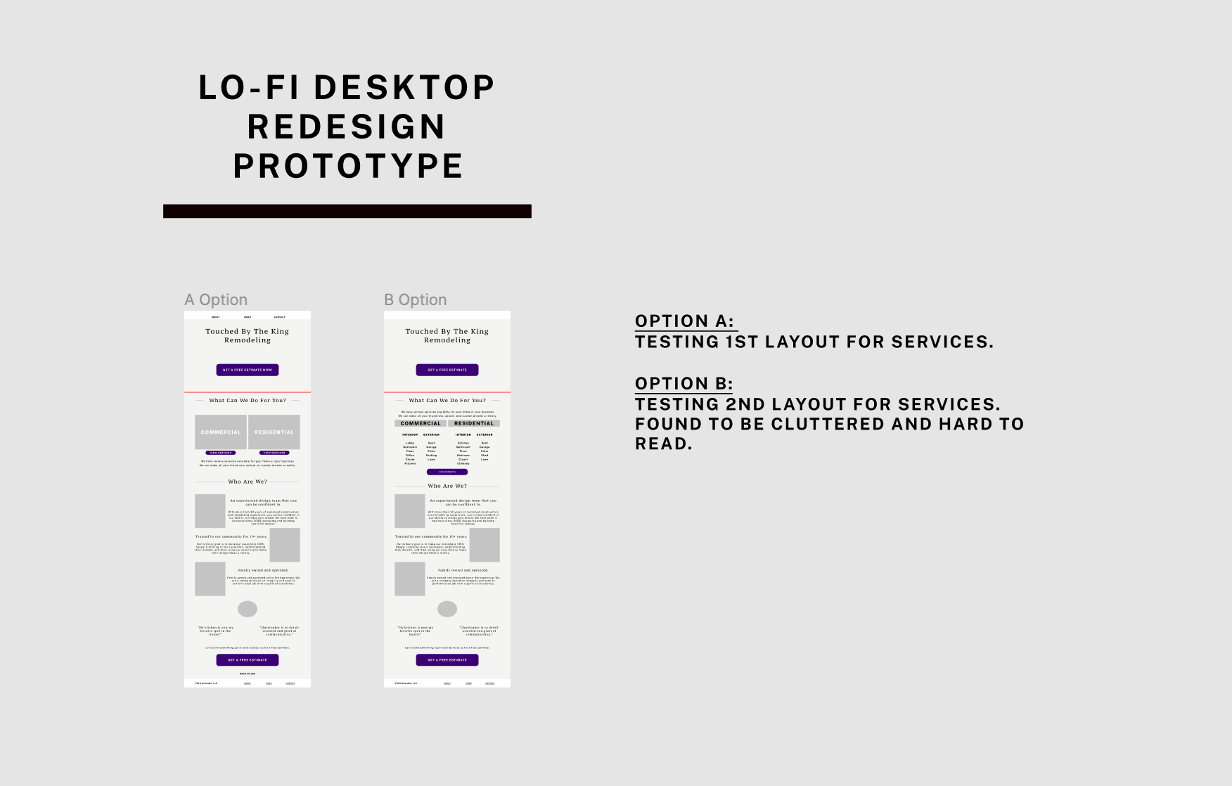
After I considered the potential redesign options in my sketchbook, I began to create the digital product.
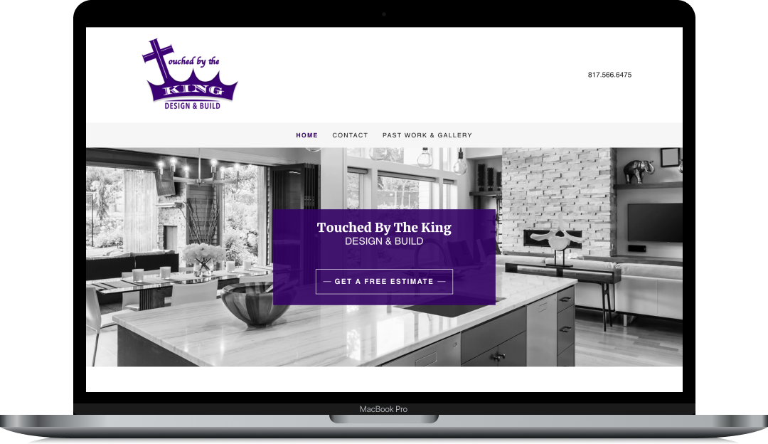
The Brand
After the wireframes were tested and approved, I shifted my focus to how I could update the brand while maintaining the established company identity.
The signature color and new palette changed a bit throughout the process as I determined what shade complemented the projects and maintained legibility and accessibility. The color scheme and tone were provided by the client based on their original brand. We briefly considered changing the main color from Royal Purple to Forest Green, but my client eliminated this idea and chose to maintain their signature purple color.
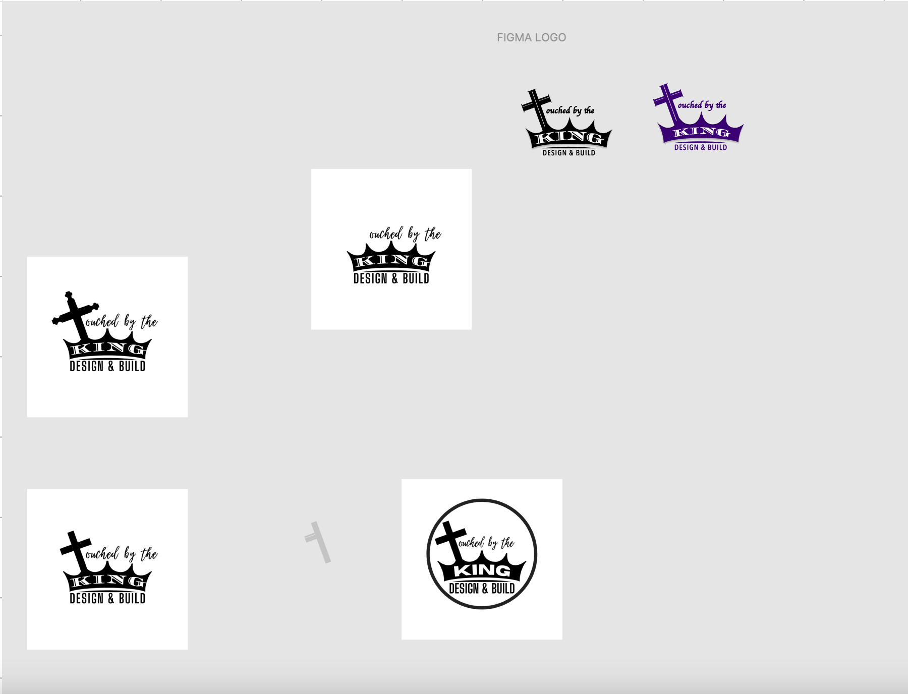
Logo Iteration
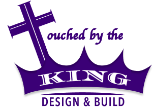
Final Approved Logo
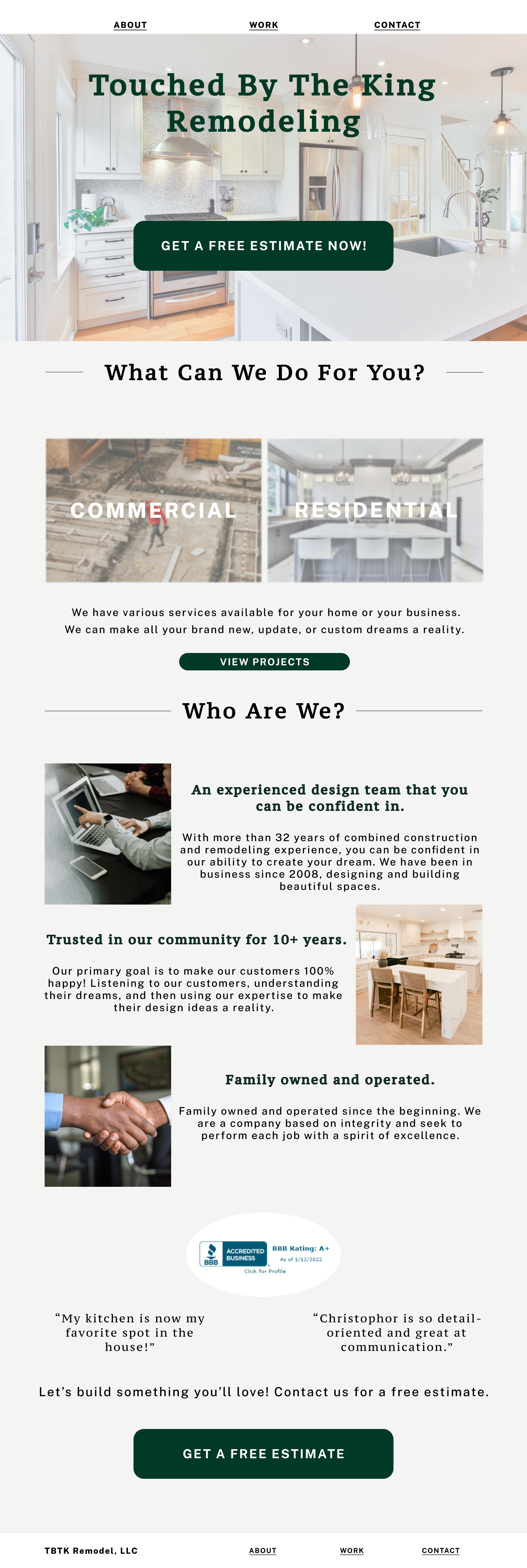
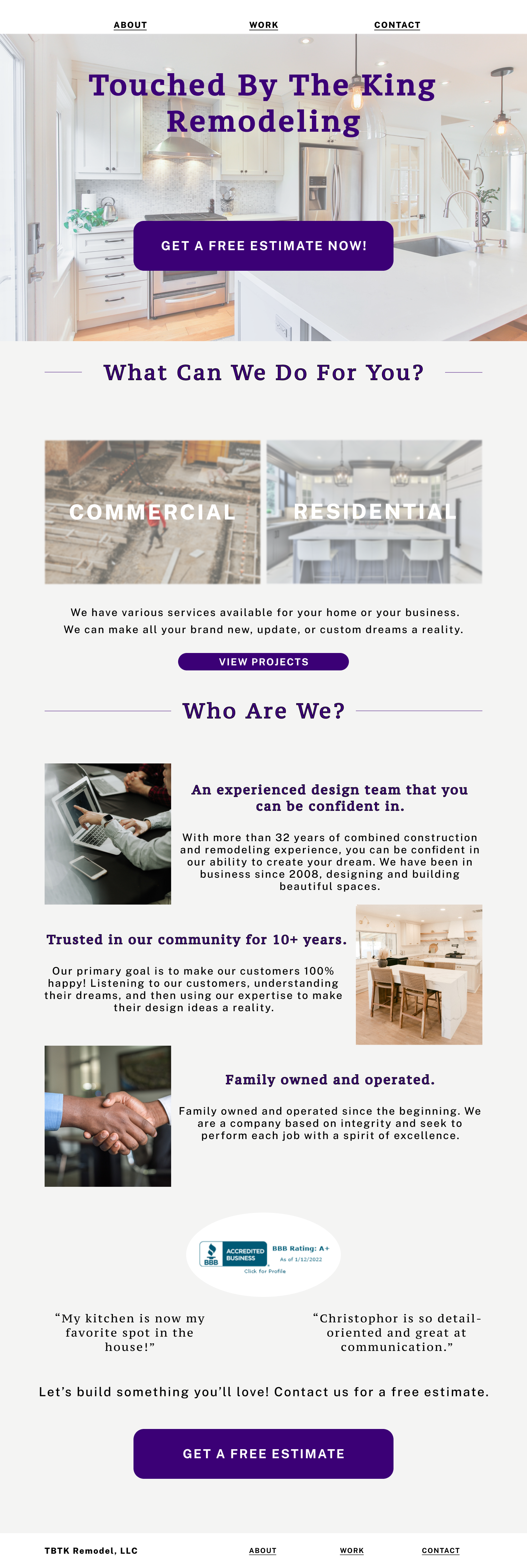
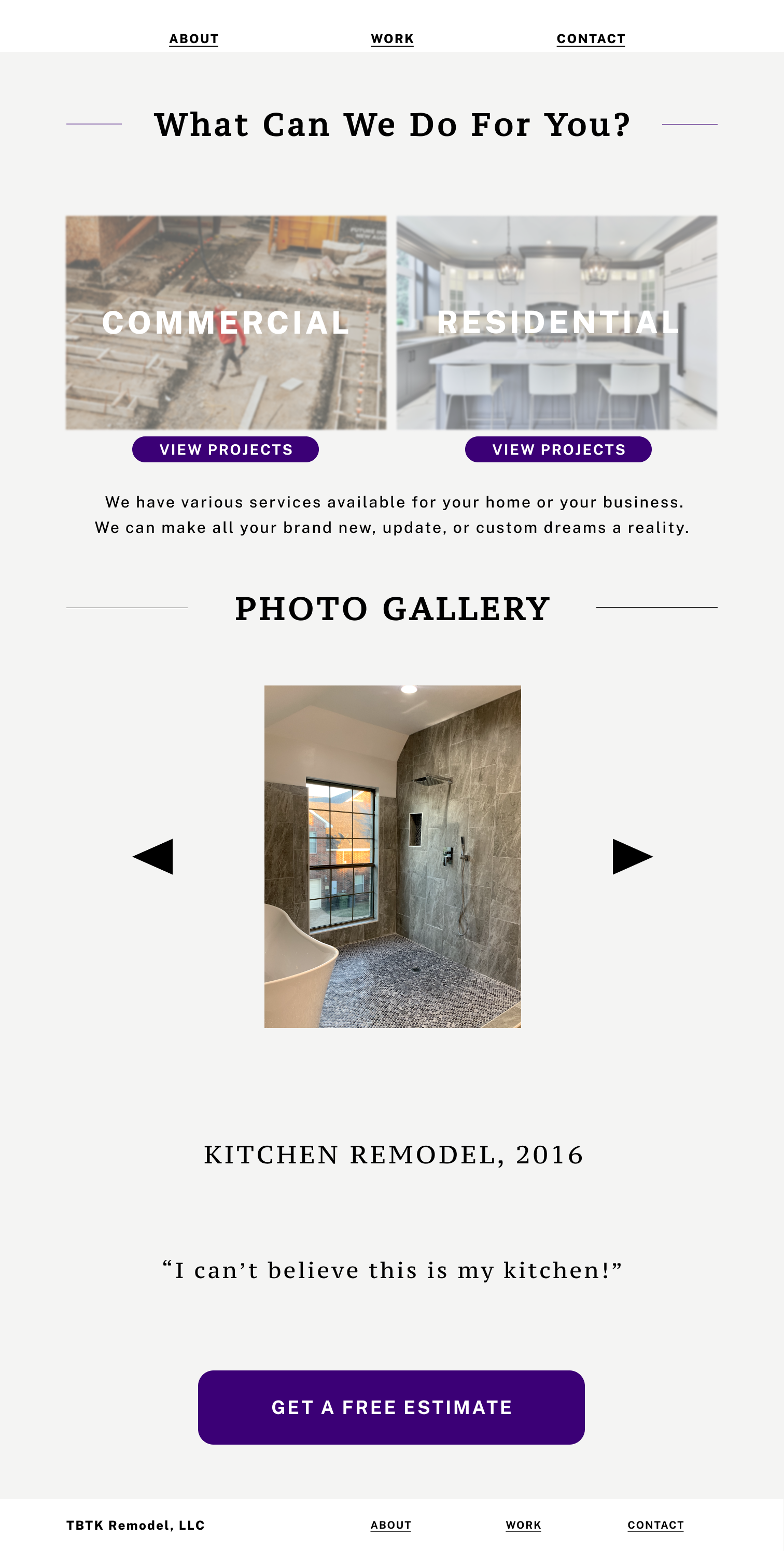
High-Fidelity Mockups
Next, I iterated on the branding decisions and created the high-fidelity mockups that would be used for final customer testing. To ensure the site’s accessibility I adjusted the main Call To Action color and minimized the complexity of the rest of the designs’ color and graphics.
Testing it Out
Once I had my structure determined for the website redesign, I conducted sessions to test the understandability of the new design with a few of my client’s customers.
By crafting a series of actions or tasks for them to complete under observation, I was able to adjust the design to ensure optimal efficiency and ease for the users.
The Outcomes
Iteration
Based on the gathered user feedback and suggestions I changed the service cards to a hover state, rather than a click state.
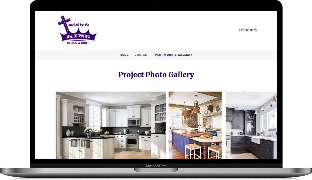
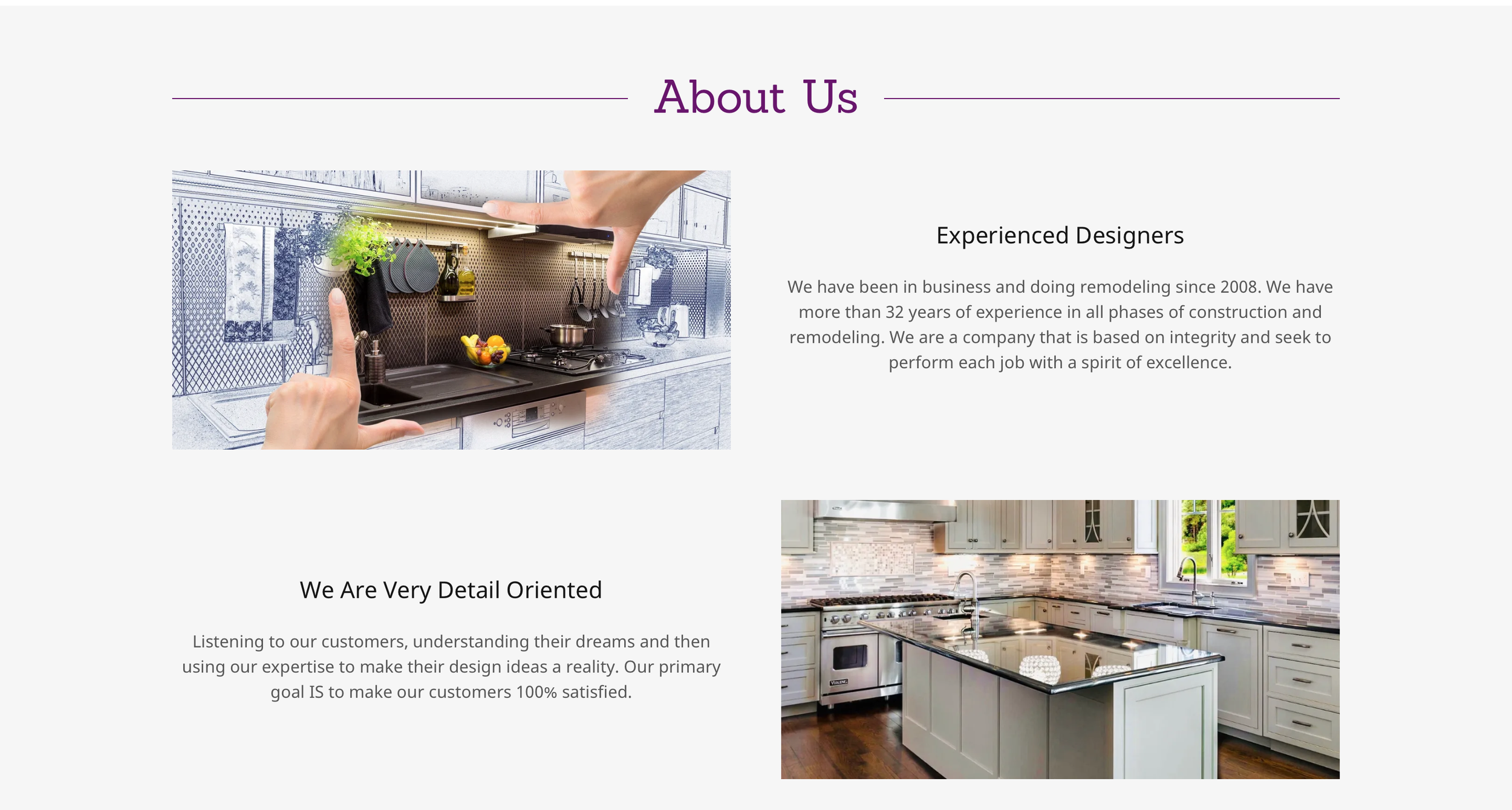
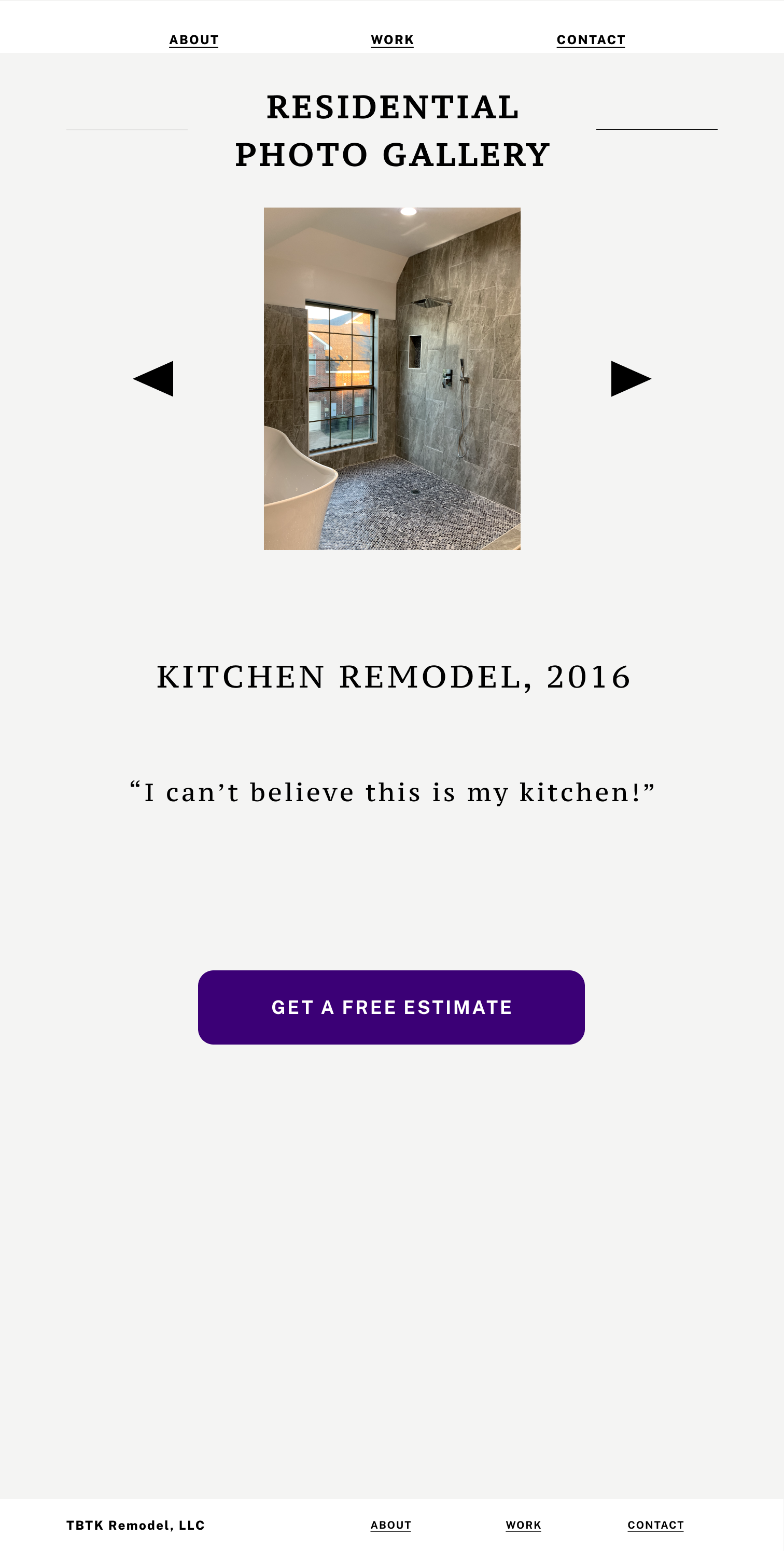
I also created a Services page in the site navigation to hold the list of services offered and a photo gallery of past work.
Results
Test participants reported that the functionality is simple and they can access the information easily. The call to action is clear. The layout of the pages and the navigation matches the mental expectations. The new logo and layout is refreshing, while maintaing the company’s established tone.


"I love the purple button, it has a regal tone."
— Test Participant 3
"The options on the service and contact page make it easy to convey my job needs to the company."
— Test Participant 4
The Solution
By restructuring and organizing the content and information on my client's website, according to the needs of my client's customers, I solved their problem of understandability.
I increased the ease of user navigation and contact task completion by 100%.
The information hierarchy is intuitive and understandable for users and their needs. The users can find and view services, photos, and reviews from the company. The Call To Action is clear through hover states and CTA colors are AAA compliant. The users are able to easily enter and submit their specific information for increased ease on the customer and the client.
Based on my successful test feedback, I decided the site was ready to be updated.
Further Development
At a later stage in the development, I plan to expand the company reach with the addition of a mobile app.
The Final Conclusion
In this project, I successfully redesigned the Touched By The King Design & Build LLC website. Since the published update on their GoDaddy platform, site traffic has increased by 83%. The company also saw 3 new projects debut based on the information and execution.
I experimented with many different iterations of designs, colors, and structures in order to come up with the most functionally desired and visually sleek product, while remaining true to the company and its pre-existing goals. I continued to expand my knowledge and skills in design software such as Figma and Adobe XD. I practiced new approaches to solving problems, such as paper prototyping.
A key factor to any successful business strategy is an understanding of the audience. Before designing digitally I worked with pen and paper, allowing a loose and quick flow of ideas for the next phases.
“Experiential docet.”
— Experience teaches