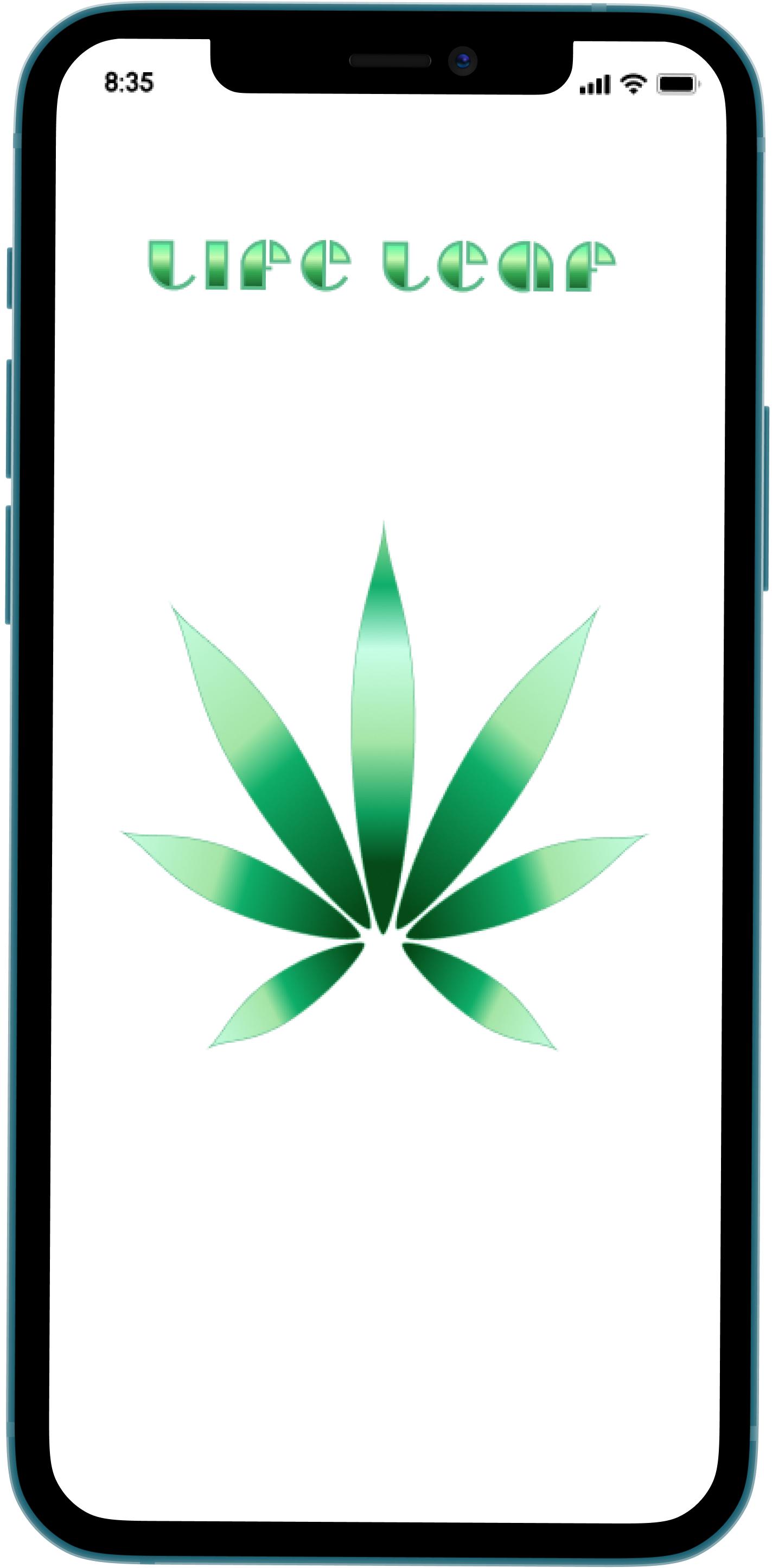
Life Leaf
A daily reminder and routine tracking app for cannabis patients based in New York.
There is a brand new, booming natural health industry in New York.
The user experience for the patients of this facet of the health industry is currently non-existent compared to that offered to other healthcare patients. I chose to create an app to assist patients in treating their personal concerns and optimizing their health management system.
Dream.
This idea evolved from a broad daily journal and reminder app into a reminder and tracking system targeted at health.
Define.
Who are the targeted users? What do they experience during their routine? How can this process be improved?
Develop.
How is the functionality of the app? How does it work? What could it look like?
Deliver.
A routine and habit-tracking app for medical and recreational patients of the New York cannabis market.
The Overview
The Team
I worked as the sole designer on this project.
The Roles
User Research
UX Design
UI Design
Prototyping
Usability Testing
The Tools
Figma
Adobe Suite
Google Suite
Canva
The Project Requirements
Craft an intuitive and customizable app for users to monitor, and manage their health goals.
Before diving into the project itself, I outlined the expected timeframe for the design process to be completed.
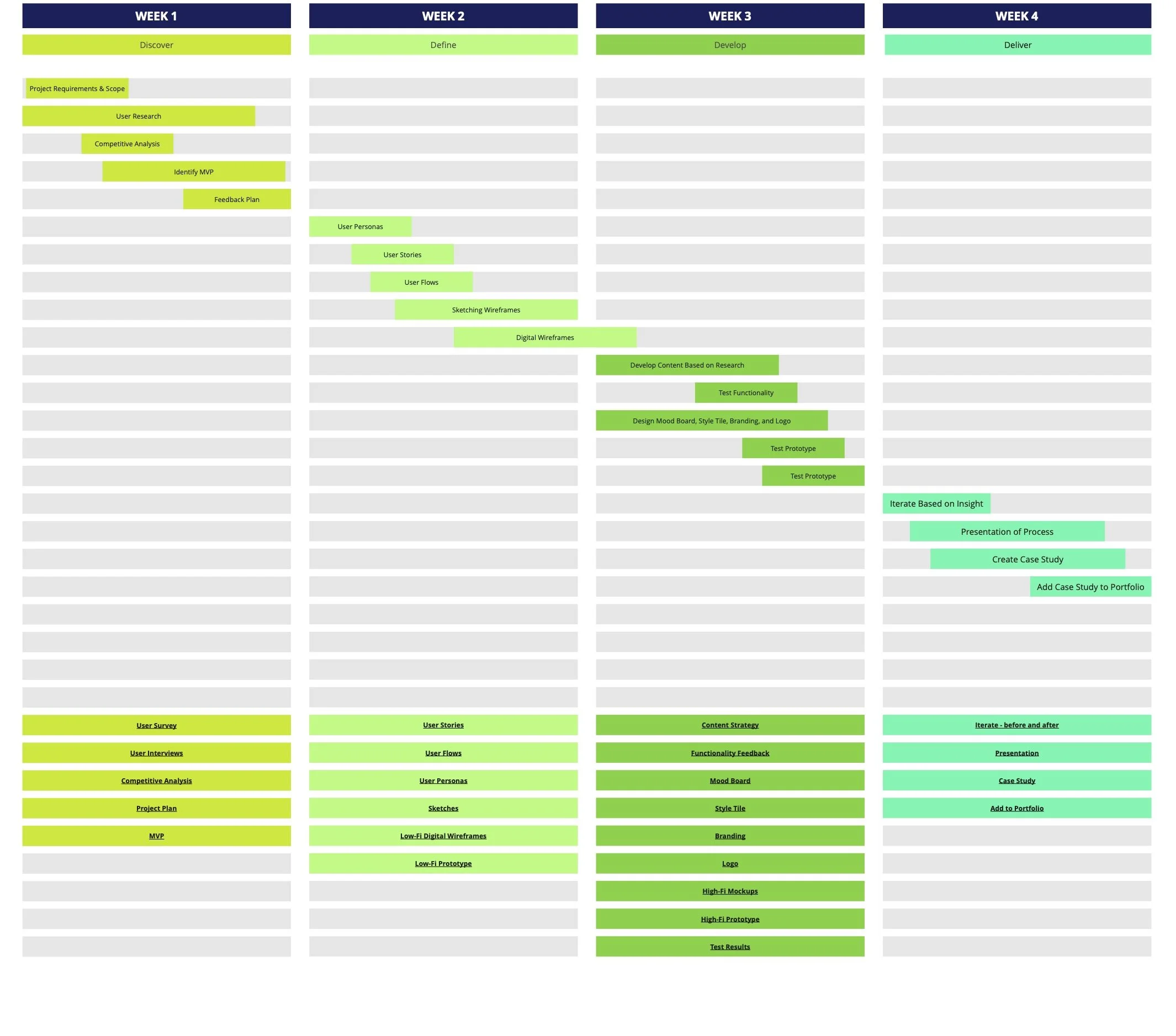
Phase One - The Research
Before jumping into the digital workspace to create a prototype, I wanted to understand the patients and their experiences to better solve their problems.
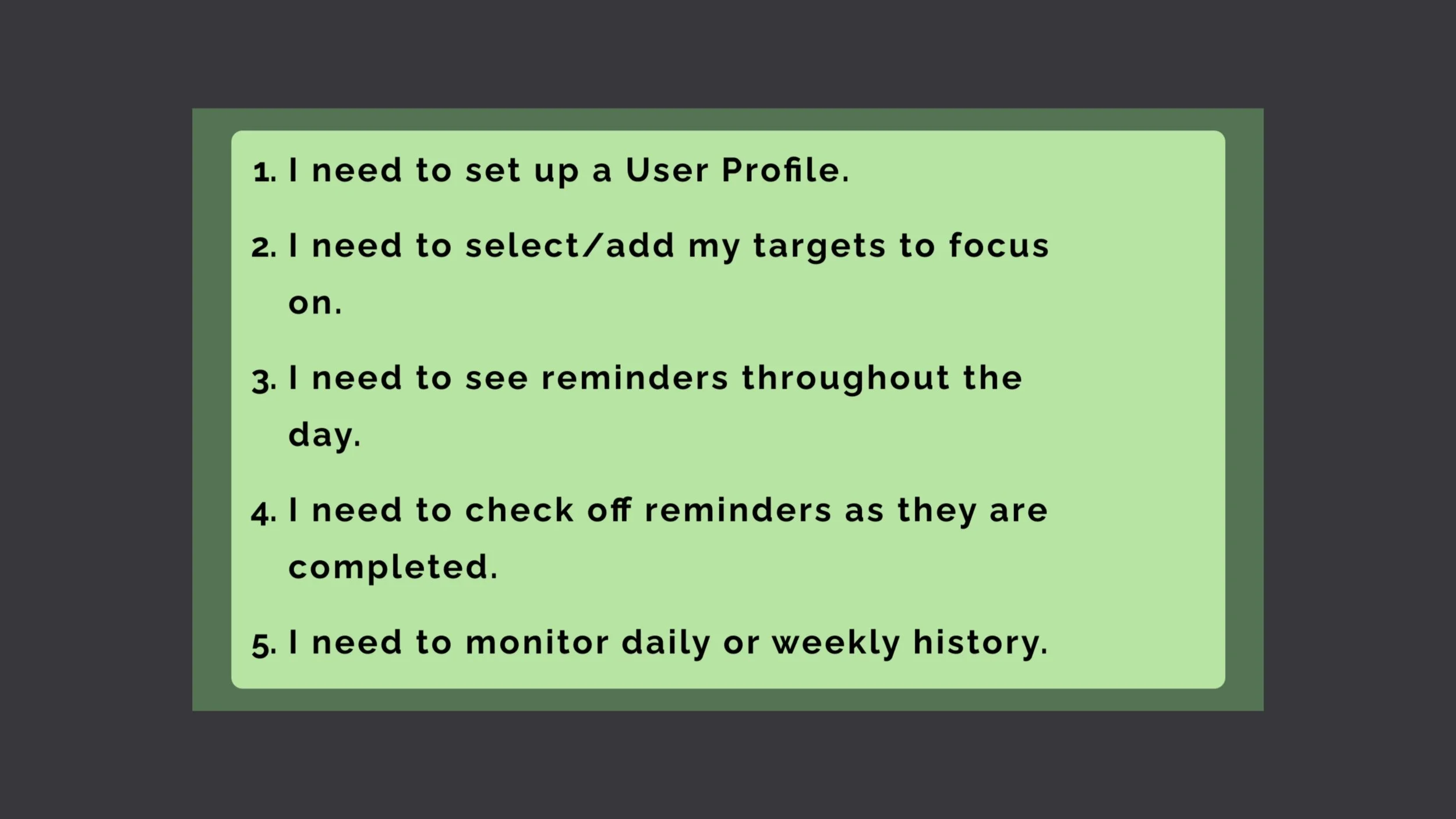
Patients will need to track their routine in a manageable timeframe.
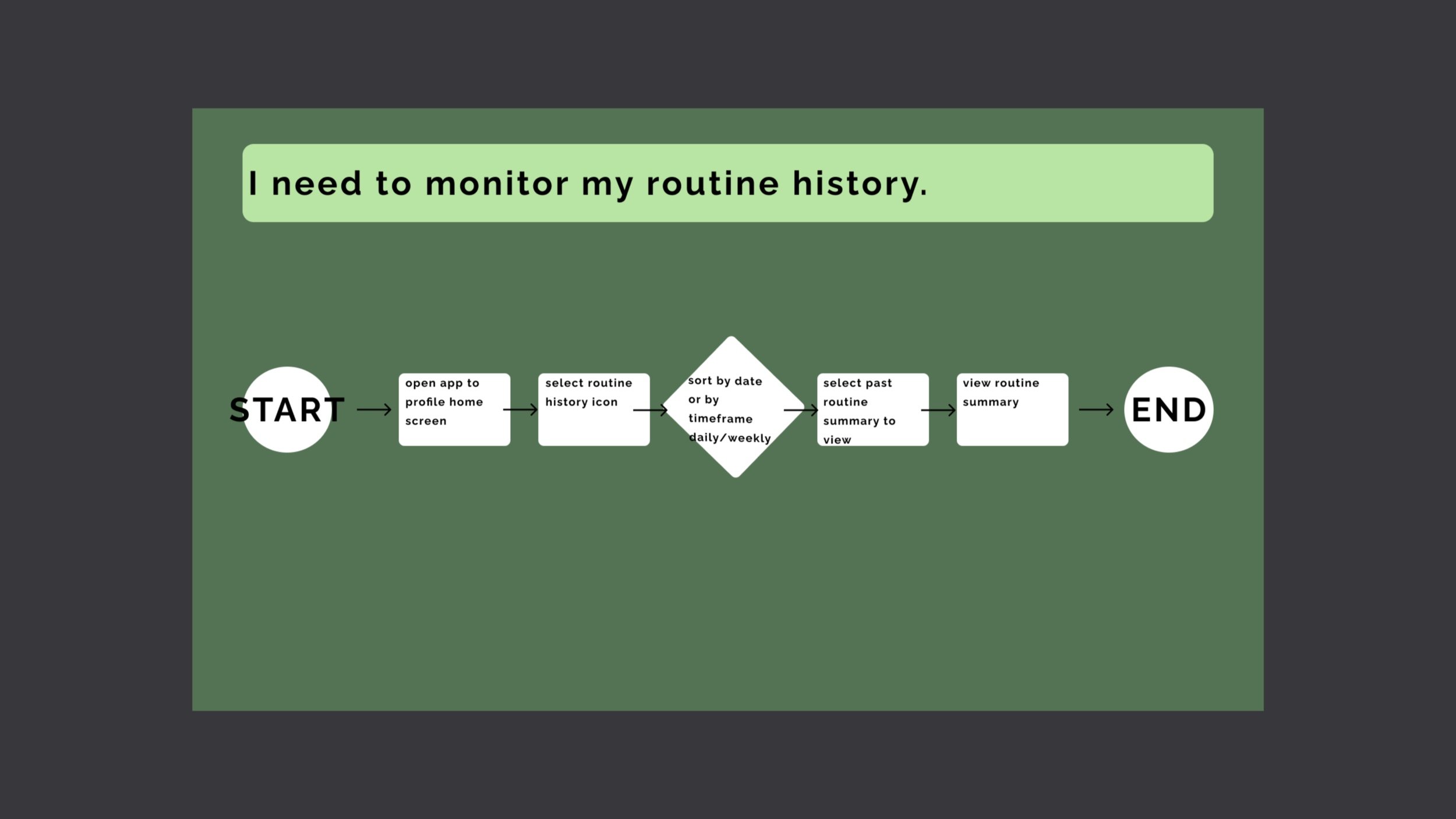
Patients will need to access their routine history to manage their progress.
Patients will need to check off reminders as they are completed.
Competitive Analysis
By assessing the design and outcome from the apps currently available on the market (ReLeaf, Calm, Leafly) I was able to see what users have access to and what they may be lacking. I found similarities in the visual design but noticed a few differences in the functional uses of these apps.
I also chose to anaylze Duolingo and the engaging nature in which the information is relayed. The idea of gamification took root, as this has proven to be successful in Duolingo’s user task and reward system.
I identified the strengths and weaknesses of Releaf and Duolingo with a SWOT chart.
ReLeaf
strengths: customizable profile, extensive symptom log, ability to track treatment sessions and after effects, saves previous prescription information
weakness: issues with the accessibility of color palette used
Duolingo
strengths: prompt reminders, engaging display and animations, gamification incentive, progress log
weakness: session time out on free accounts, alerts can become an annoyance
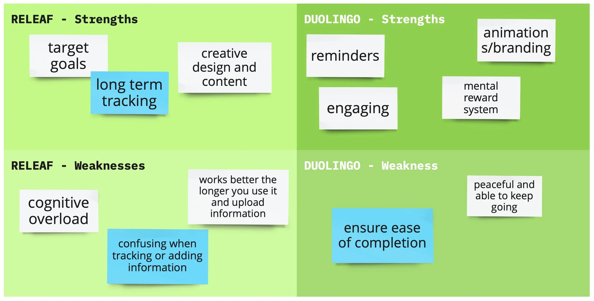
Analysis of ReLeaf and Duolingo
The Survey
I created and conducted surveys with patients based in New York, Oregon, Massachusetts, and Texas to gain insight into their routines, demographics, motivations, and pain points.
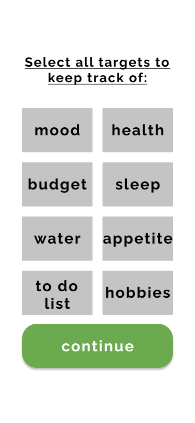
What kind of information do you want to track?
Patients listed Mood State, Budget, Sleep, and Water Intake as the most important.
High to Low Priority Features
Patient Ages
Based on the 11 survey participants’ results, I found the ages to primarily range from 18 to 79.
- 18-29
- 30-49
- 50-79
- 18-29
- 30-49
- 50-79
The Interview
I conducted in-person and remote phone interviews with a few of the prior survey participants to follow up on their individual routines, and ways they could be improved. I interviewed 4 patients, ranging in age from 20 to 53.
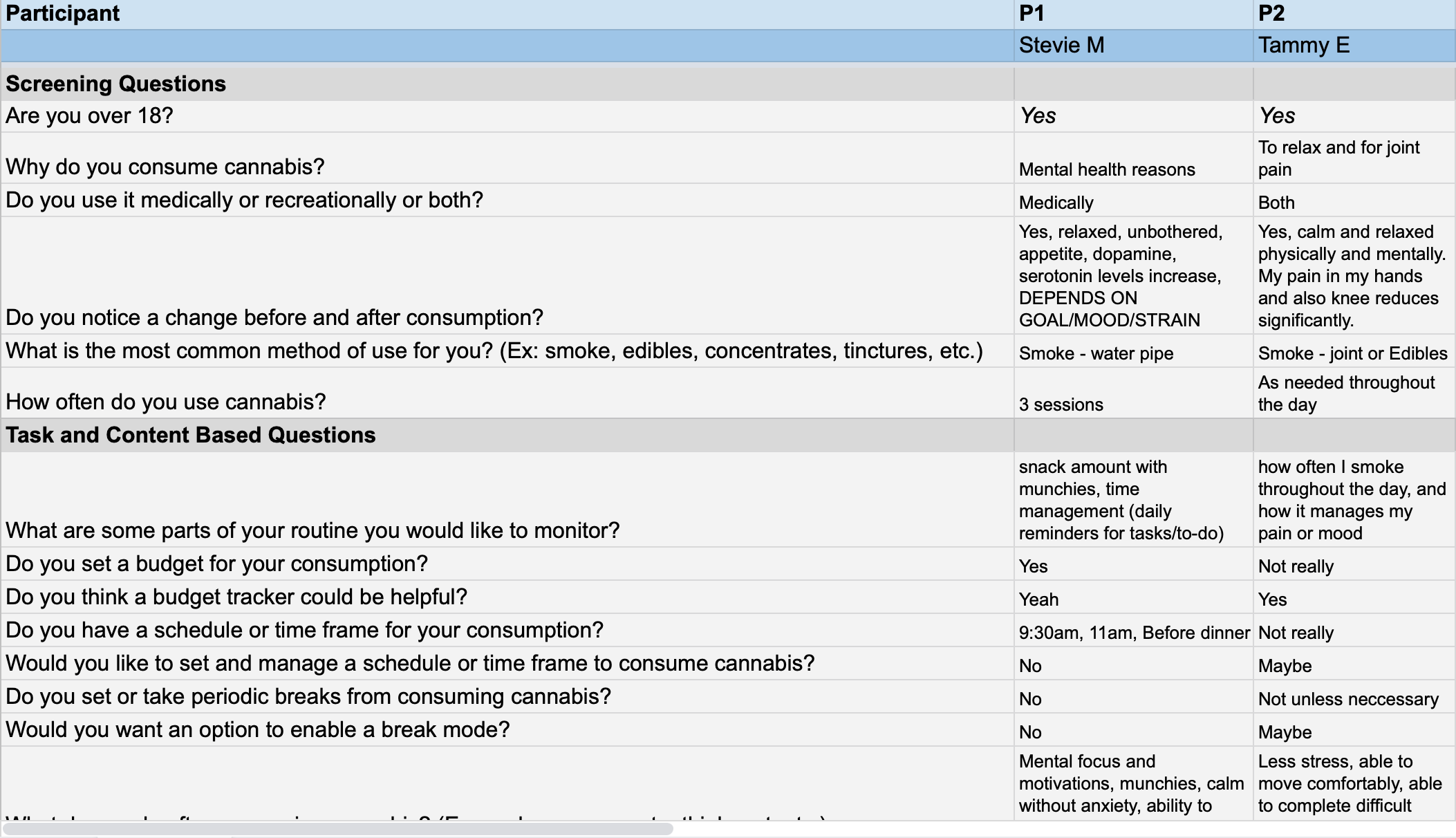
Key User Insights
Automated reminders would assist in reducing the number of forgotten tasks.
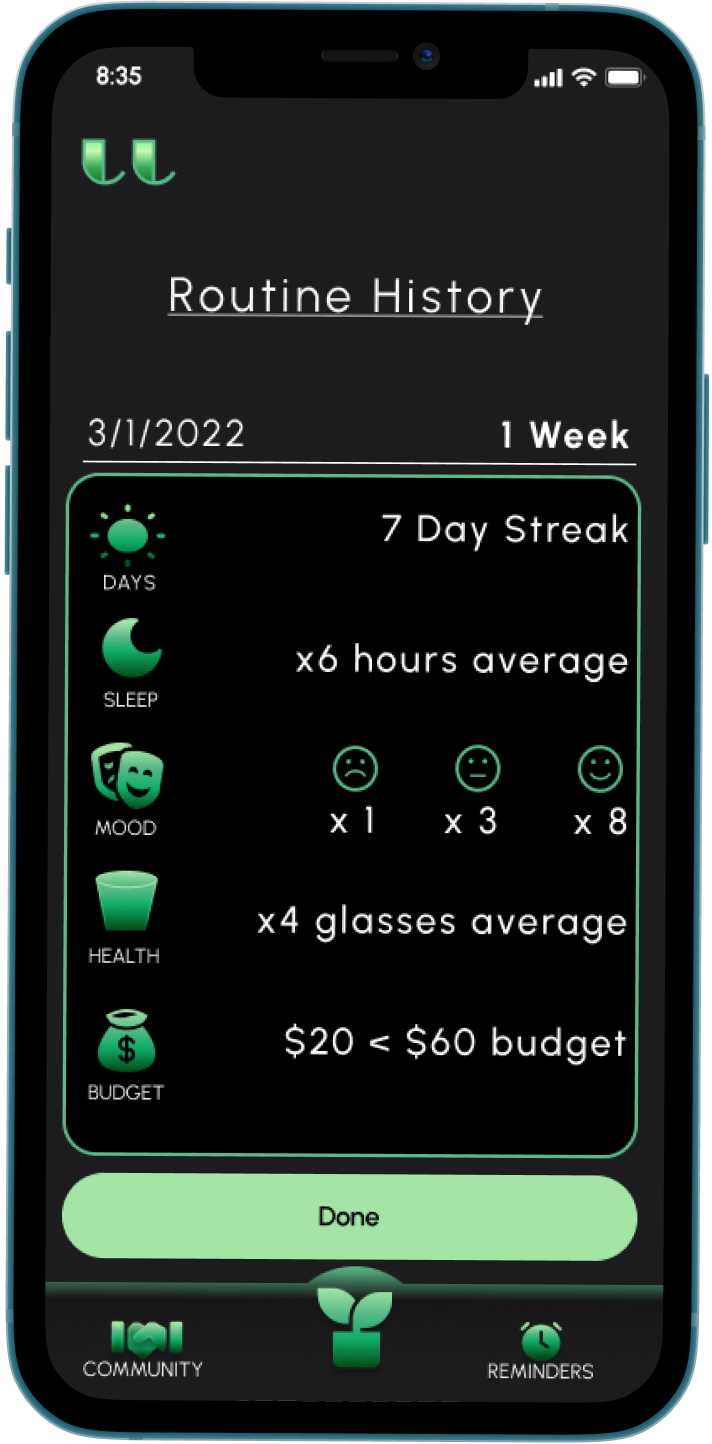
I determined a daily or weekly log will allow the patients to notice patterns and repeated habits when managing their health on a day-to-day basis. I considered a 30-day limit, but this proves to be too long of a time period to provide accurate guidance in establishing a new routine.
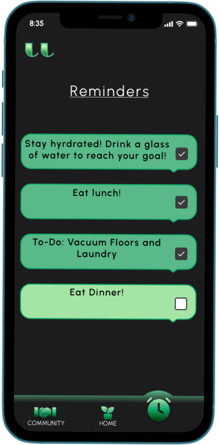
A daily task list of reminders and goals will give patients the ability to stay within their designated budgets, adhere to a treatment schedule, and track their positive progress easily.
Personas
Based on the demographic and personal information of the users gathered during the initial research phase, I created two Personas and two respective Journey Maps.


Phase Two - The Design
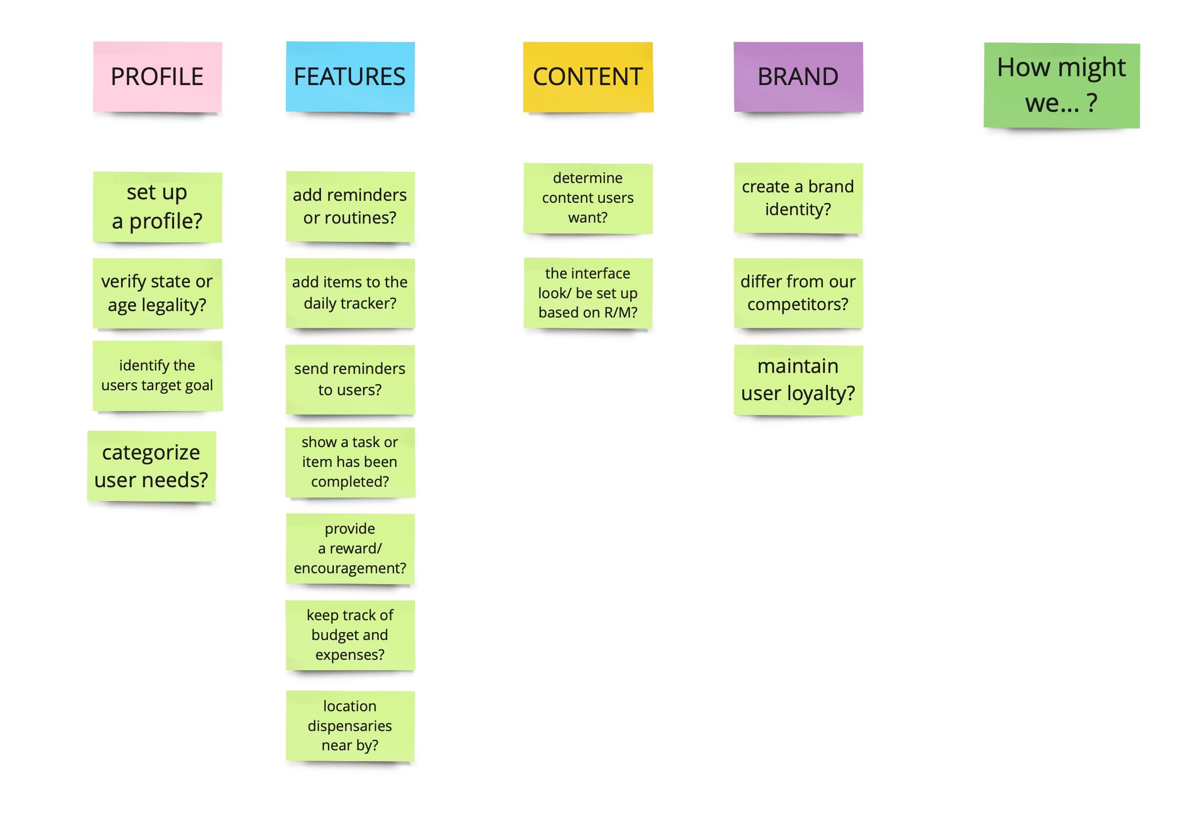
After completing my research into the targeted audience, I compiled that data with the data that was given to me in order to determine the necessary functions the users would need from the app. I organized those functions from highest to lowest priority.
User Stories
Based on the necessary information and desired features, I organized all the possible user stories from highest priority to lowest priority to maintain the scope of the project.
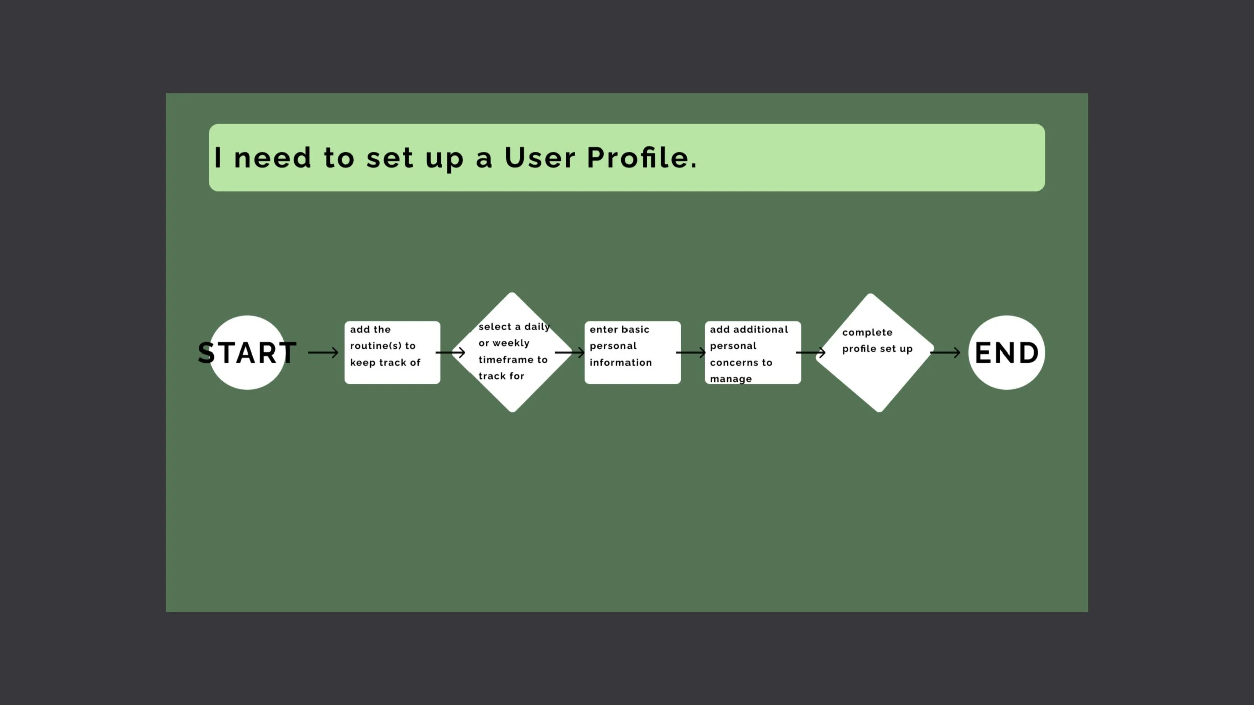
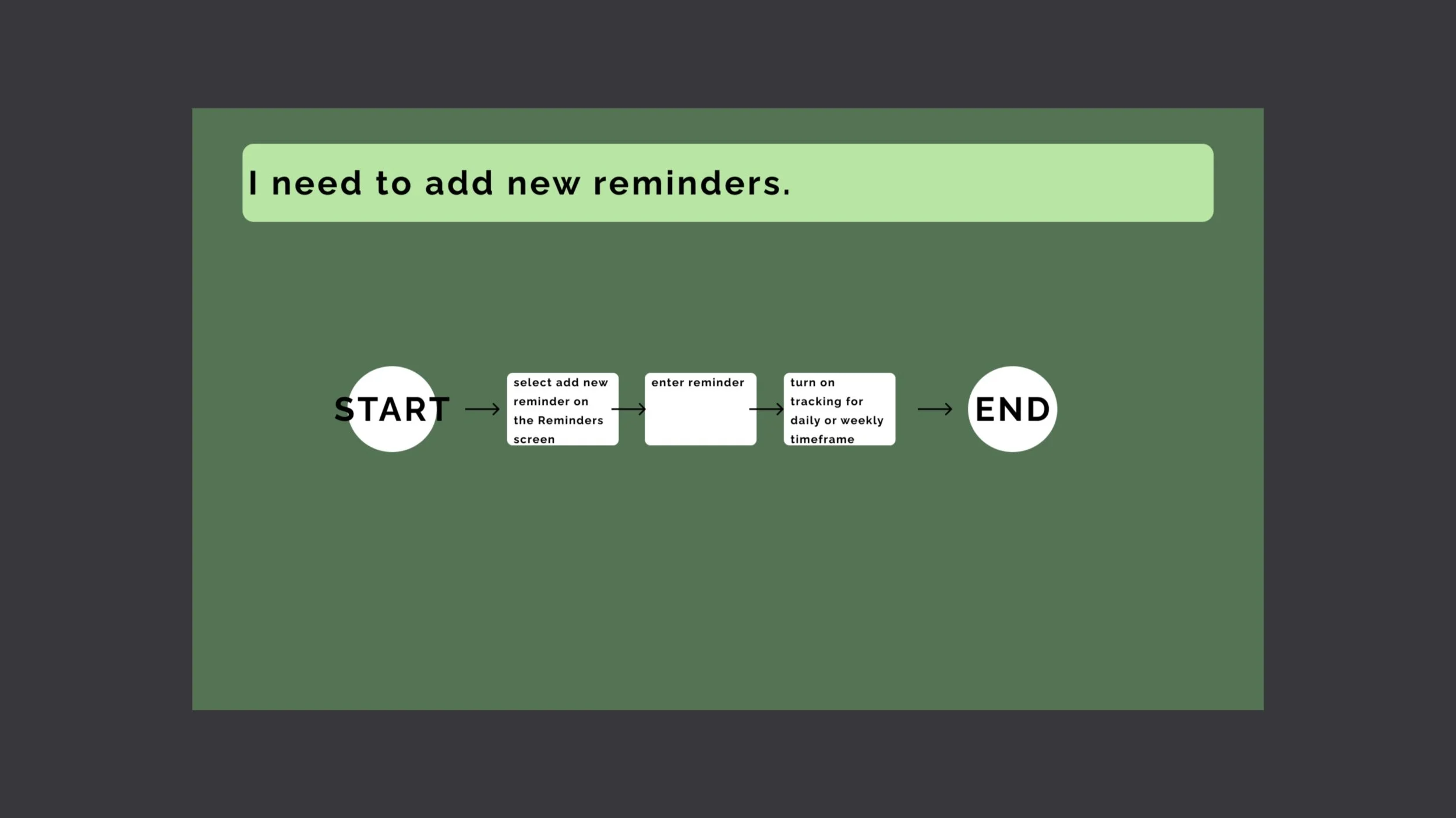
User Flows
The MVP User Stories I focused on became the base for my User Flows that would dictate the interactions within the app. I broke each main epic into bite-sized stages for the ease of translation into the digital design. I placed myself in the place of the user and thought out step by step how I could accomplish this process.
“As a patient…”

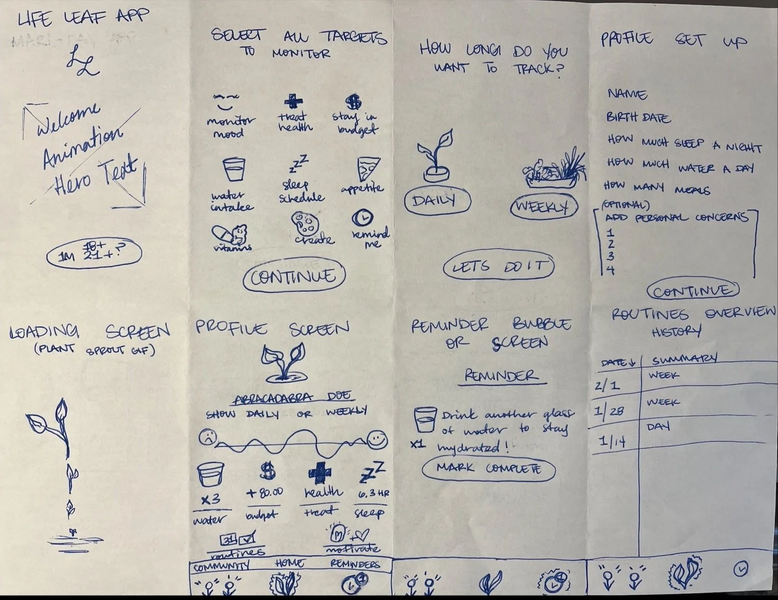
Sketches
I started with developing my solutions on paper: sketching out all the potential ways I could lay out the information and optimize the users day to day experience. I enjoy the ability to quickly generate broad ideas when working with my pen and sketch pad.
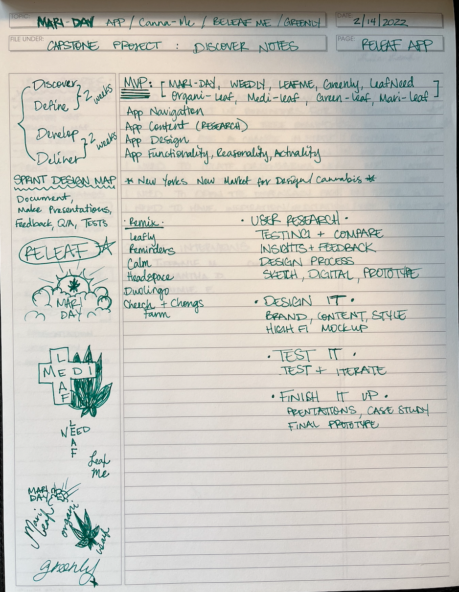
Notes
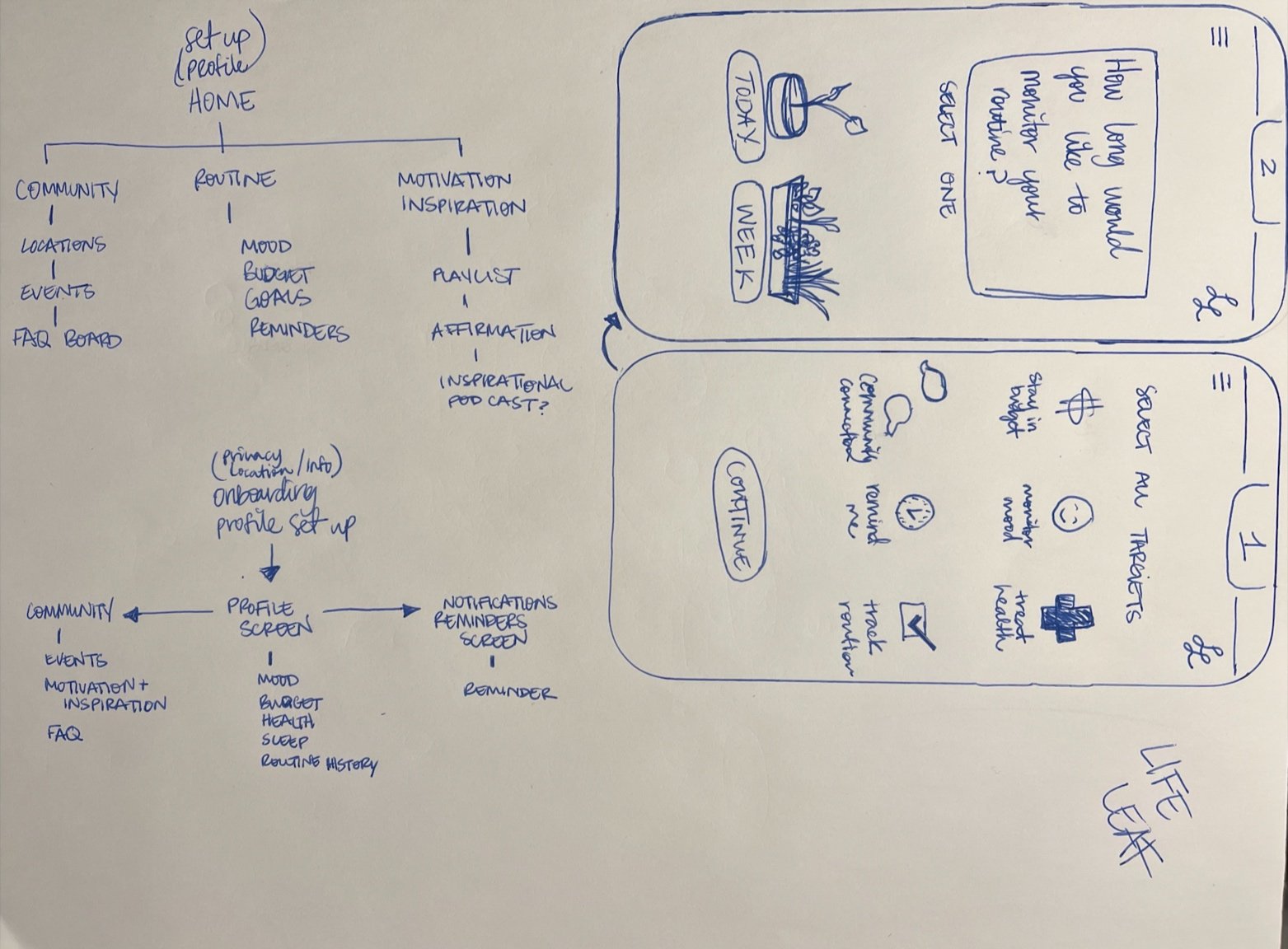
Site Map and Home Screen Ideation
Sketches of Screen Layouts
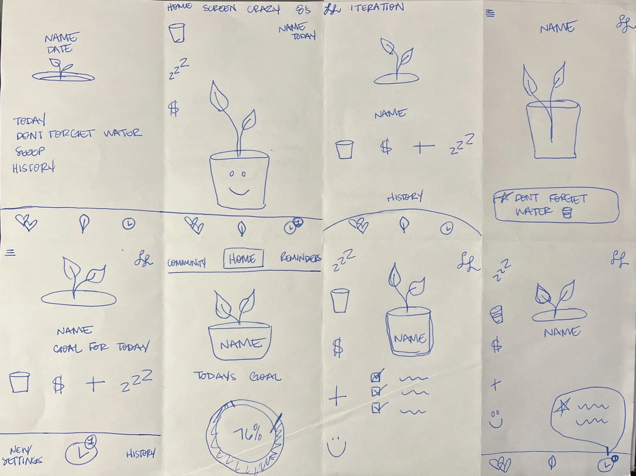
Crazy 8’s of Profile Screen
Wireframes
After I laid out all the potential options on paper, I was able to narrow my scope down to what was absolutely necessary to complete the User’s routine tracking needs.
I returned to Figma to begin my digital designs.
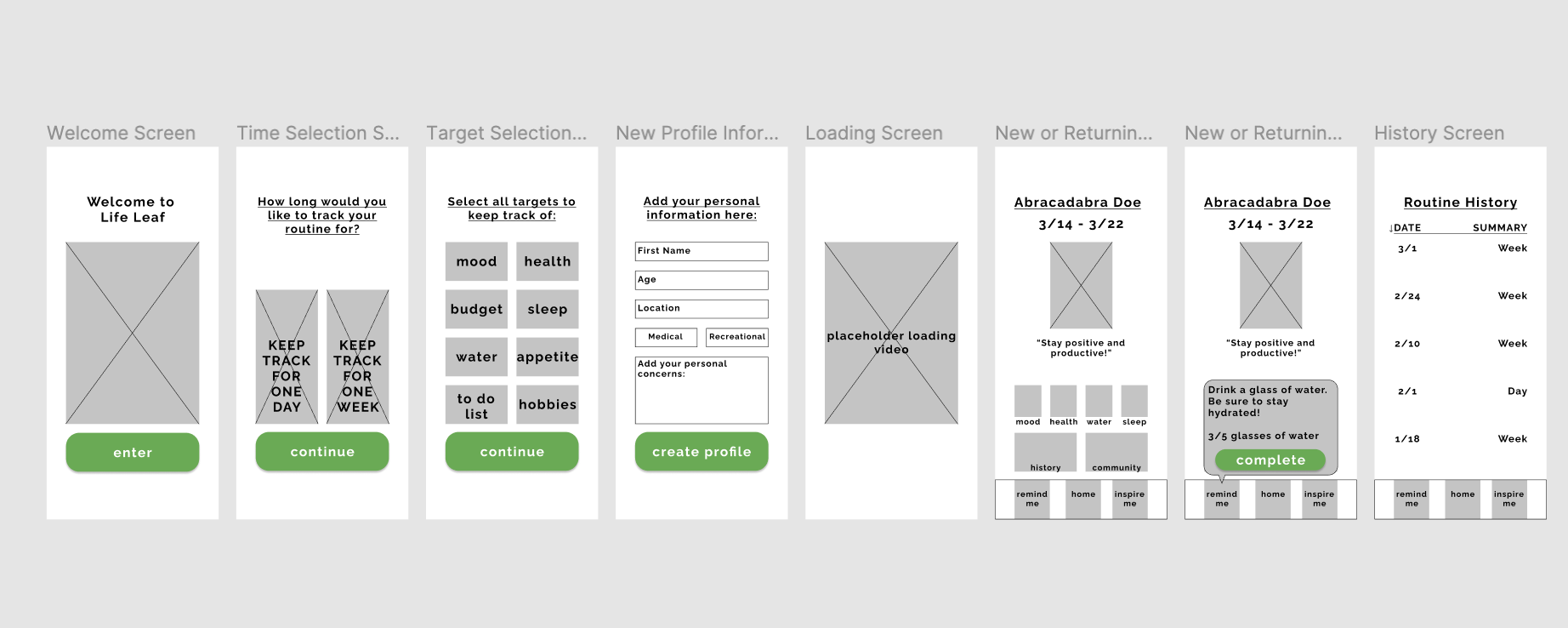
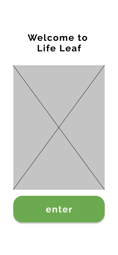
First iteration landing screen
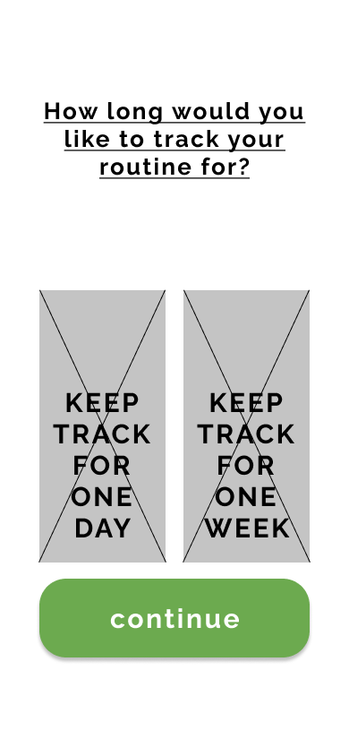
First iteration tracking selection screen
First iteration categories screen
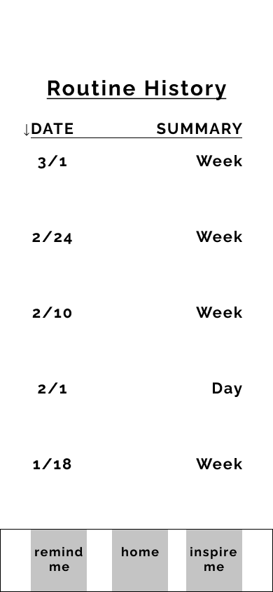
First iteration history screen
The Brand
After the wireframes were tested and approved, I shifted my focus to branding.
Based on the natural and holistic nature of the app I selected a monochromatic green palette for the brand. The accent colors differed slightly throughout the process as I determined what color combination expressed the calm and sleek tone desired as well as maintained legibility.
I wanted to evoke a soft and friendly emotion through the curved, bubble font for the logo and app name.
Maintaining a consistent design with the buttons, content, and colors was essential to achieving a supportive and calming atmosphere.
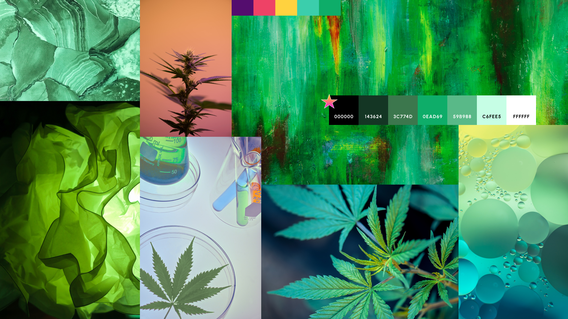
Mood Board
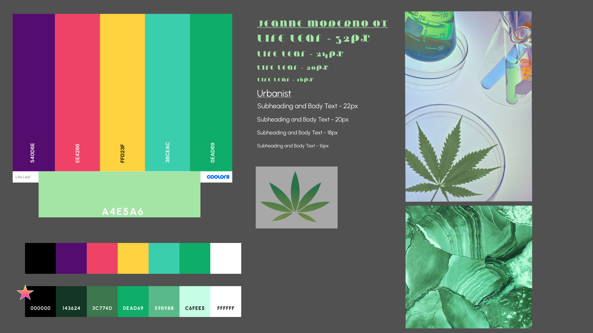
Style Tile
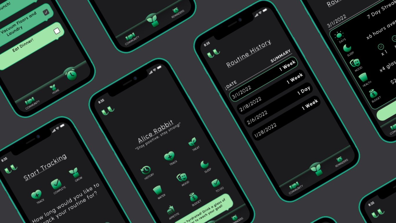
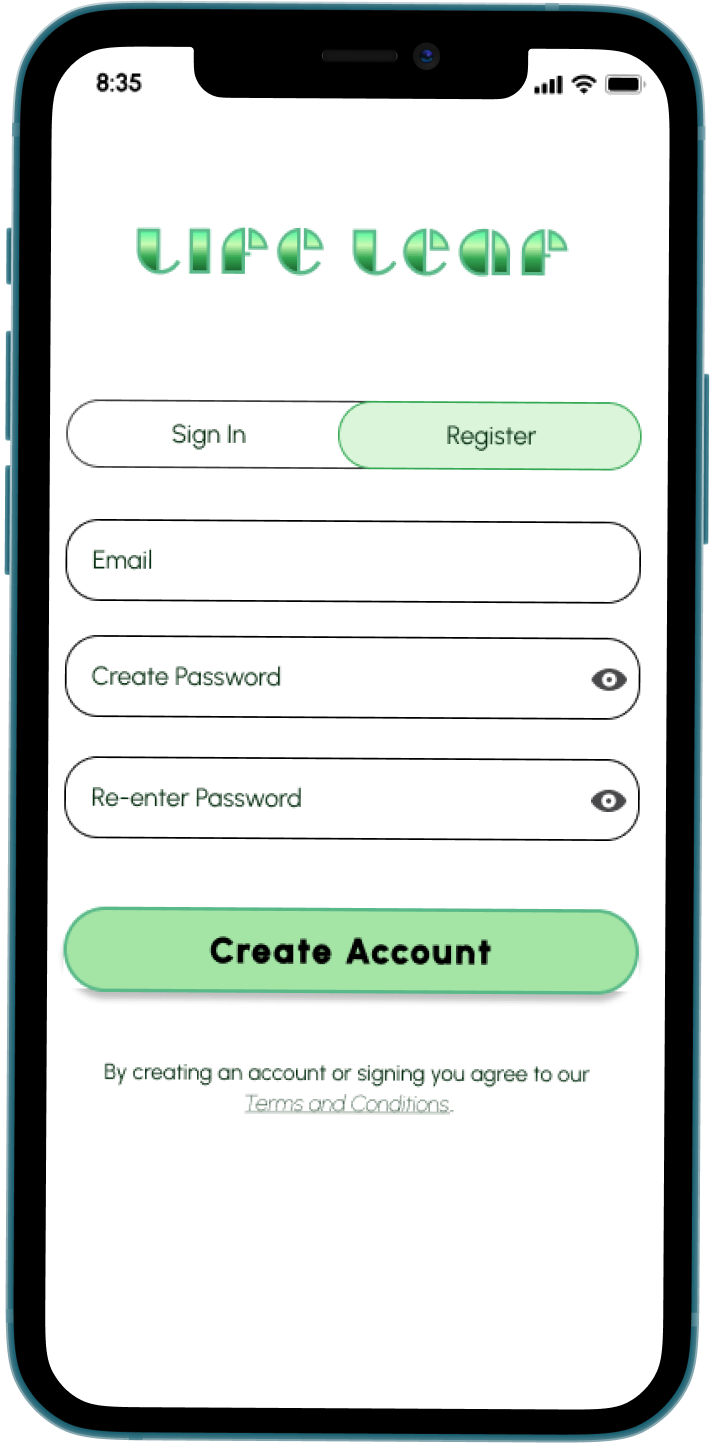
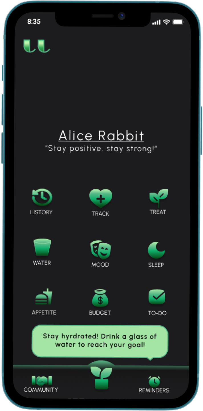
High-Fidelity Mockups
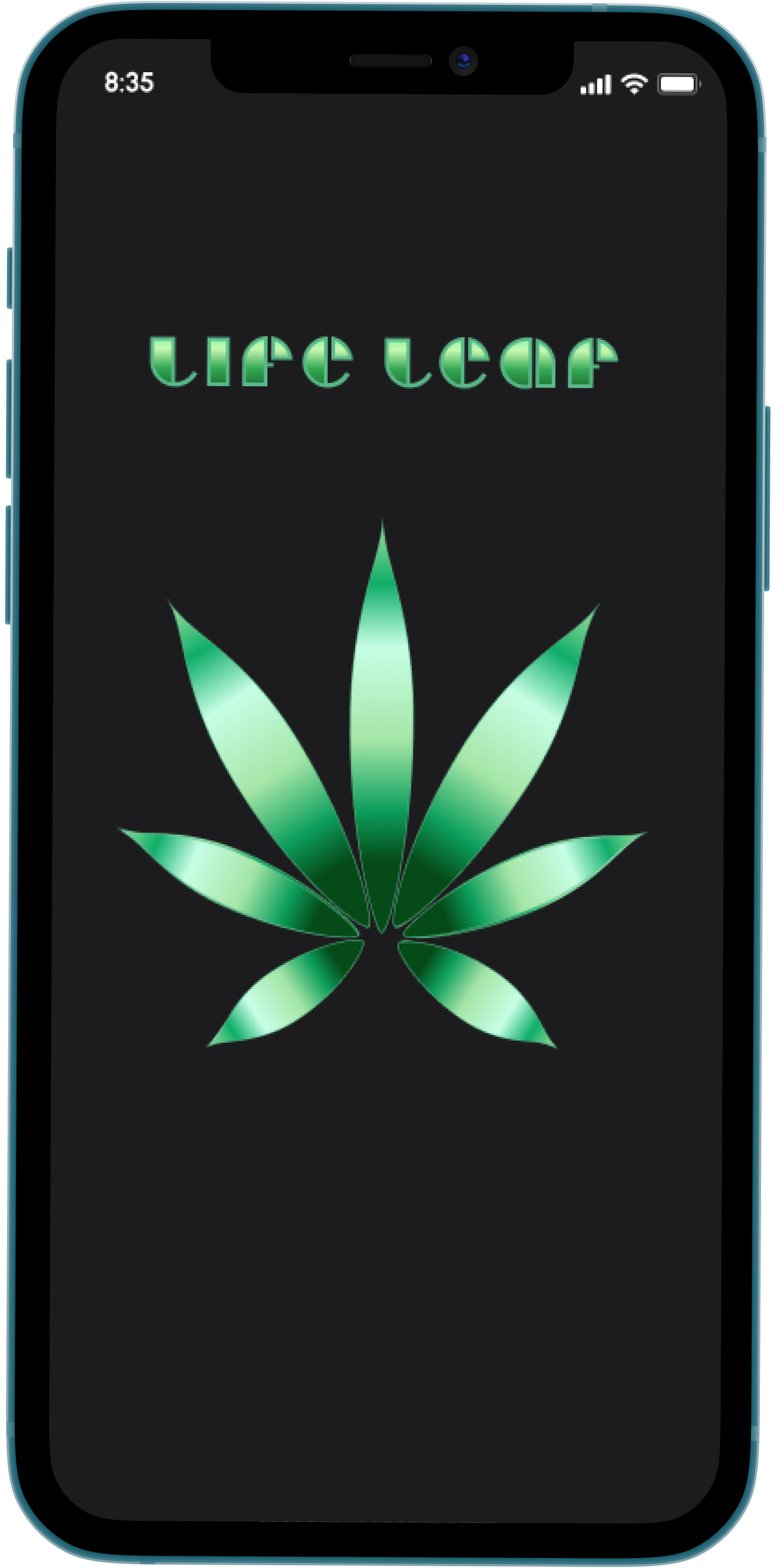
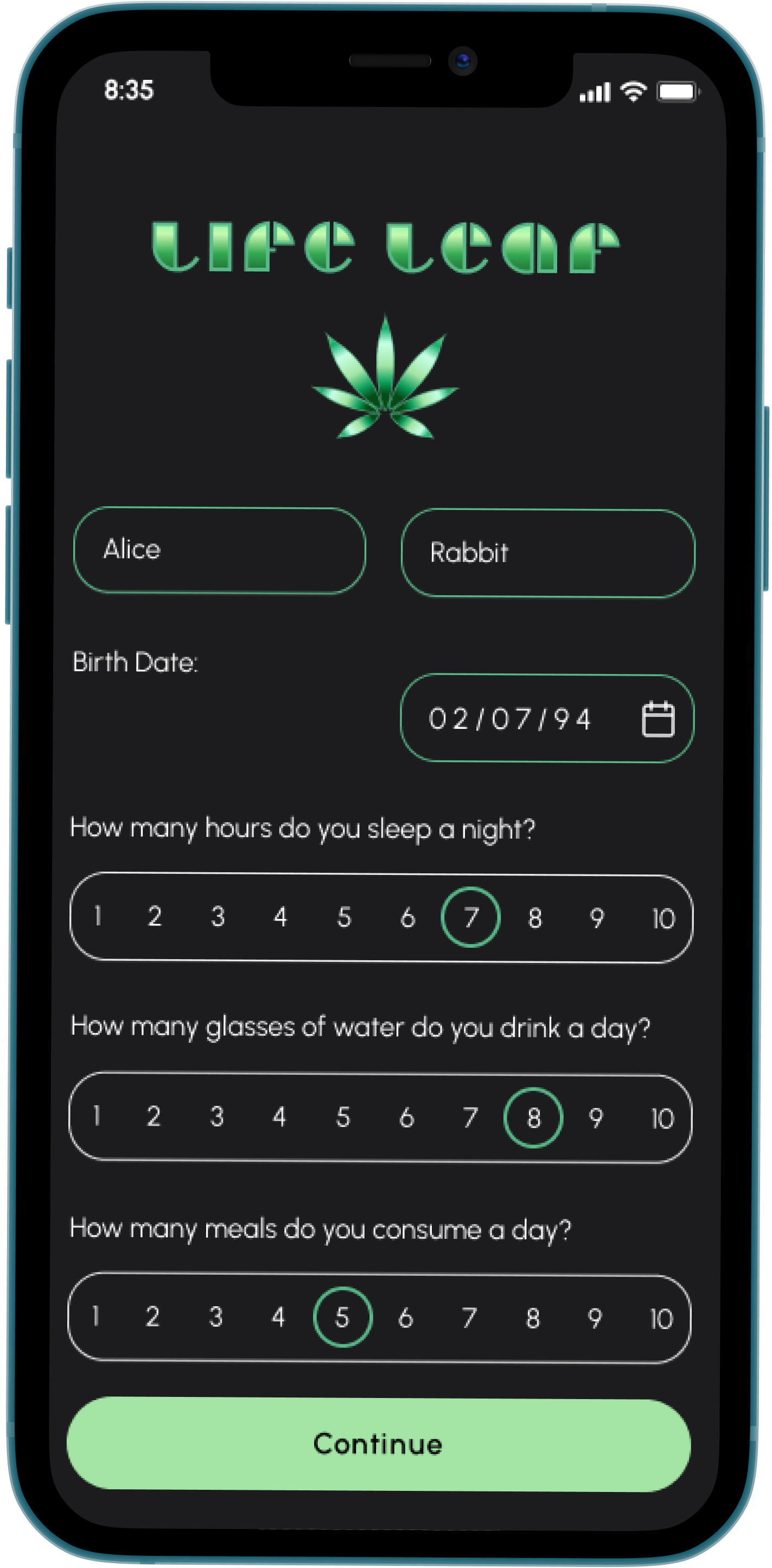
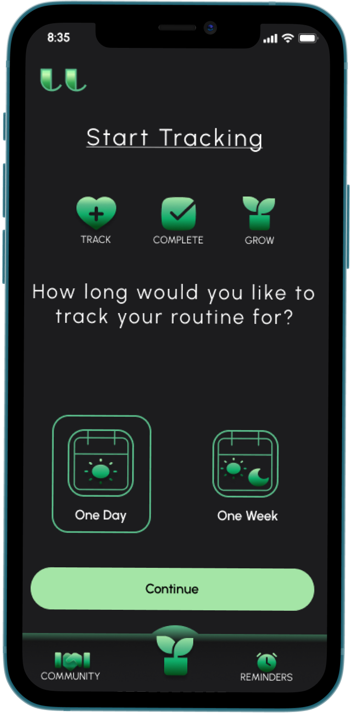
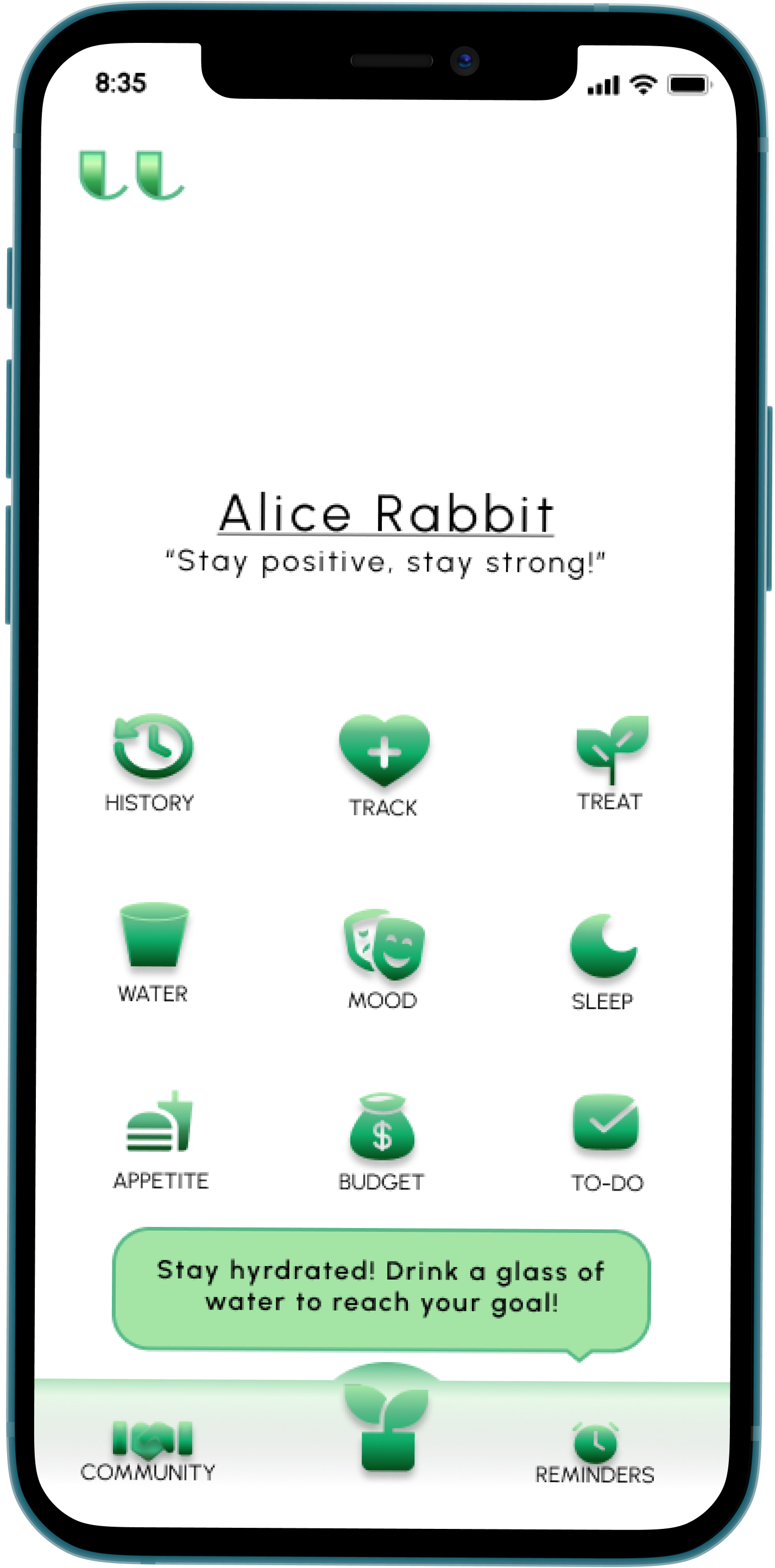
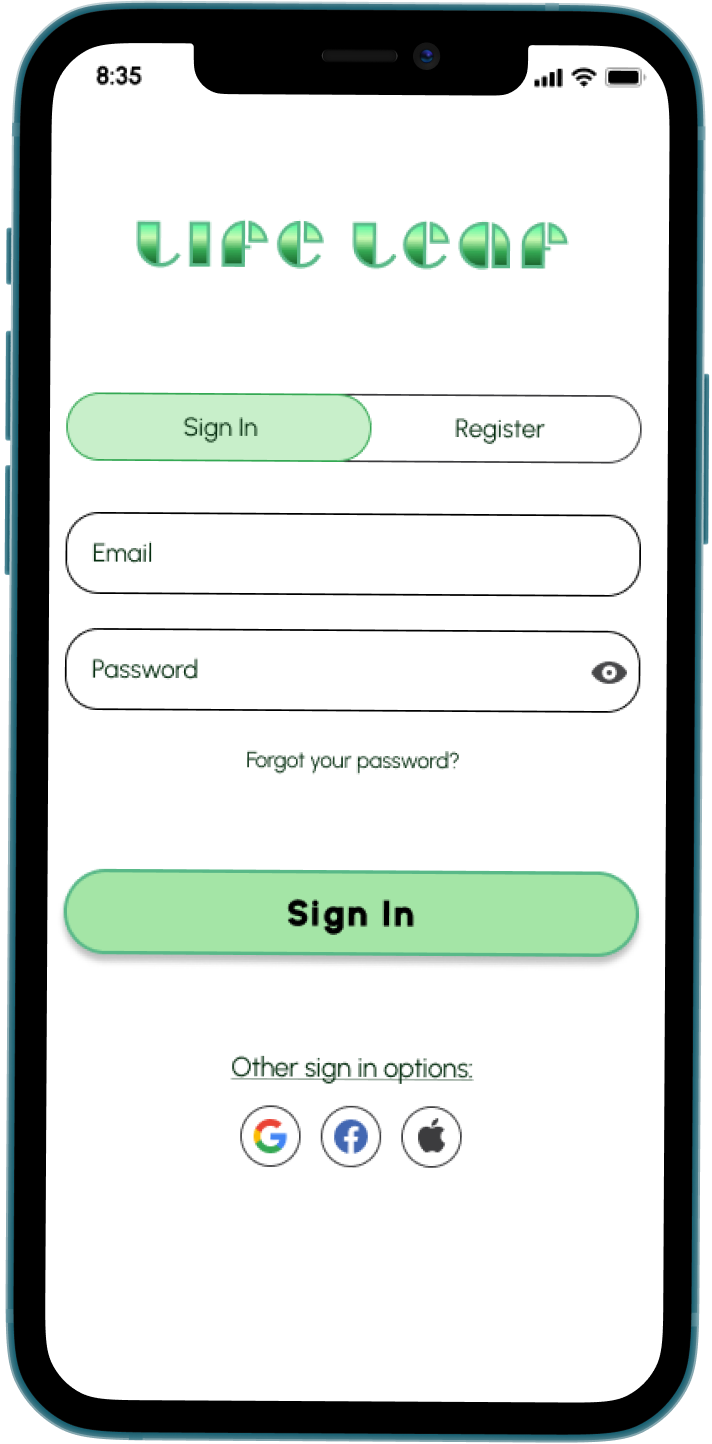
The next step was to take the brand brief and create the high-fidelity mockups that would be used for final testing. Based on current industry trends I decided to focus the MVP design in Dark Mode. To ensure accessibility for all and display both states of the design, I have Light Mode worked out in a few screens as well.
I briefly considered a potential Green Mode color palette, but decided against this iteration after I checked the color contrast, and it failed to meet AA and AAA standards.
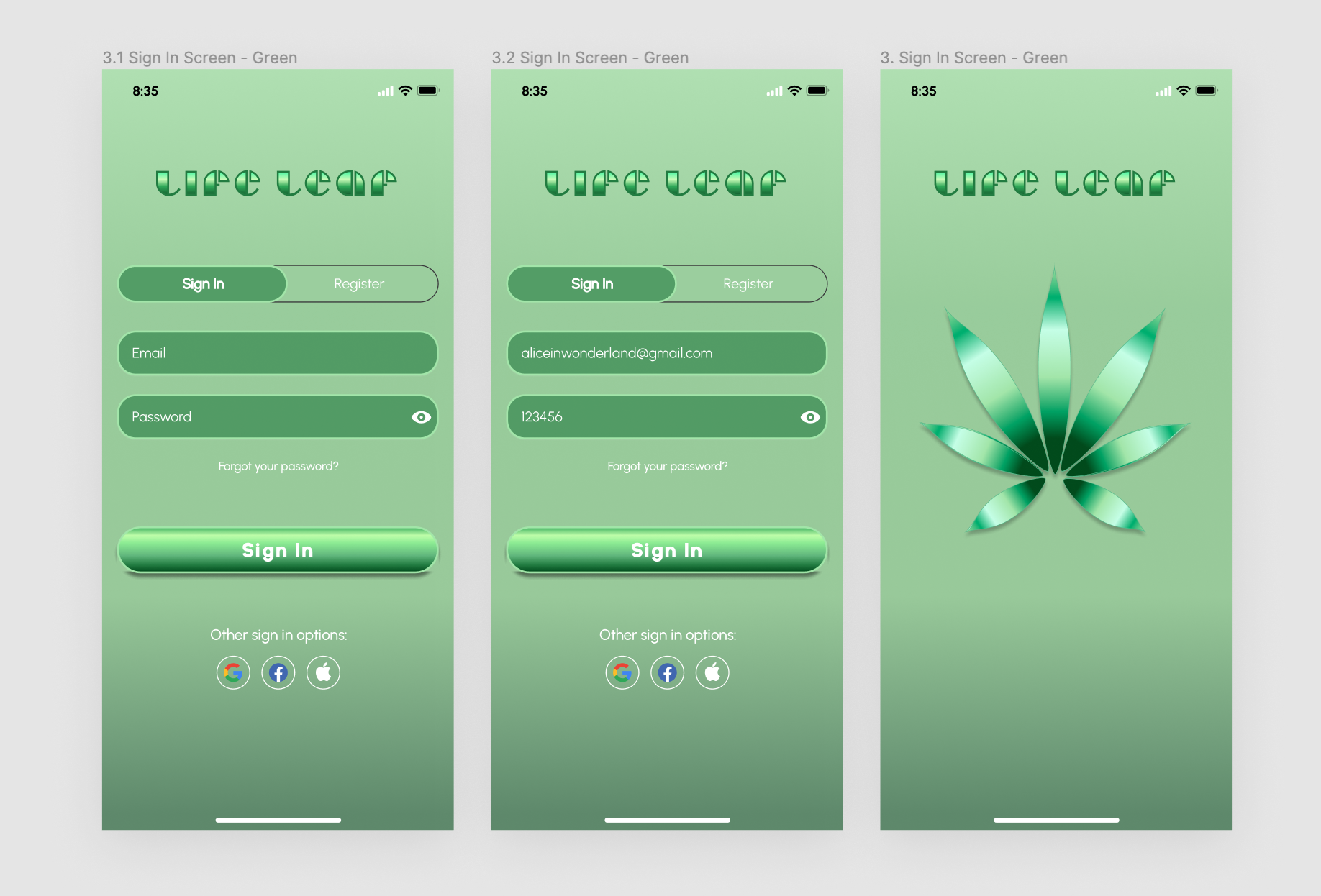
Green Palette Iteration (canceled)
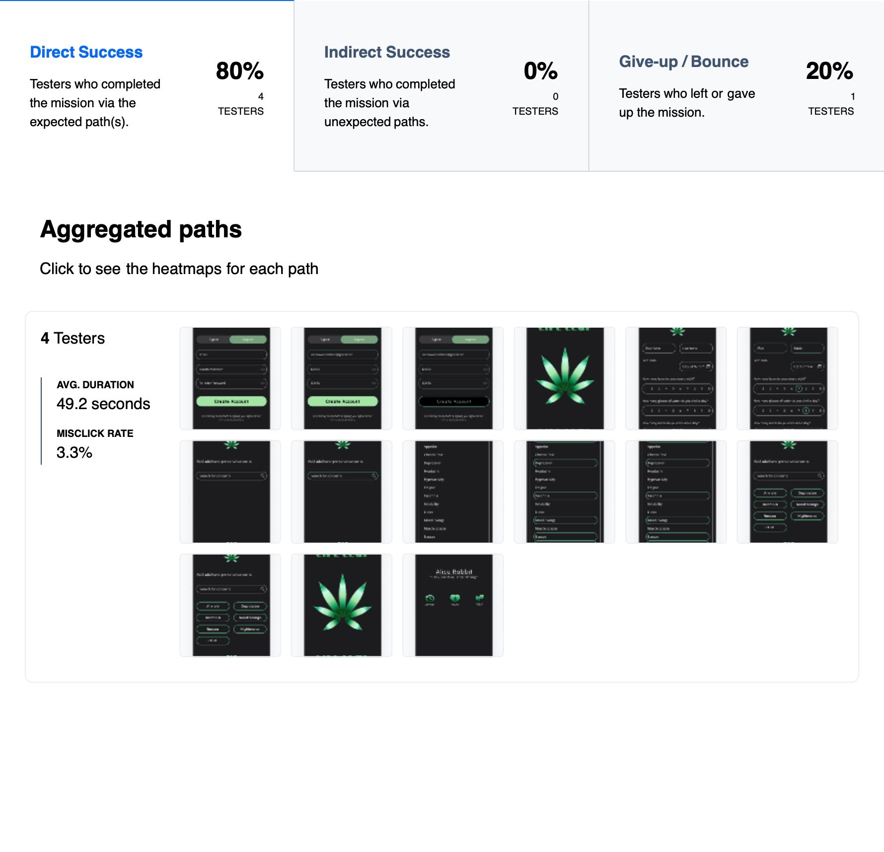
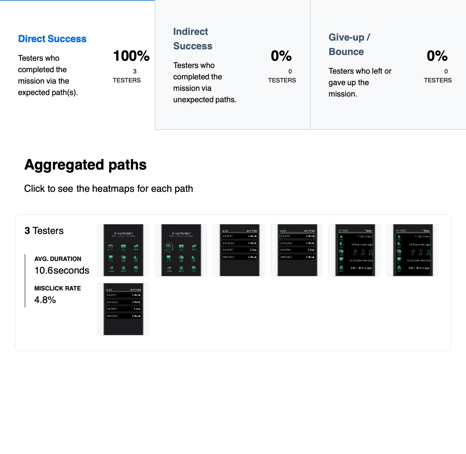

The Usability Test
Once I had my MVP low fidelity screens, I set up sessions to test the understandability of the design with a couple of participants from the audience research surveys conducted in the first phases of the project. By crafting a series of actions or tasks for them to complete under observation, I was able to adjust the design to ensure optimal efficiency and ease for the users.
The Outcomes
Reiteration
A recommendation I found to be important was to label the icons to be certain the user is able to complete the needed goal. I chose to prioritize the highest priority information in the MVP design.
After receiving positive feedback on the low fidelity designs I was able to begin to embellish the visual design of the app.
Results
Test participants reported that the app is simple and necessary information is found easily. The call to action is clear. The layout of the pages and the navigation matches the mental expectations. The branding is accessible, while communticating a holistic and calming tone.
“I can tell this would keep me on top on my health!”
— TAMMY, patient
“The reminders help to keep your wellbeing in mind.”
— JAKE, patient
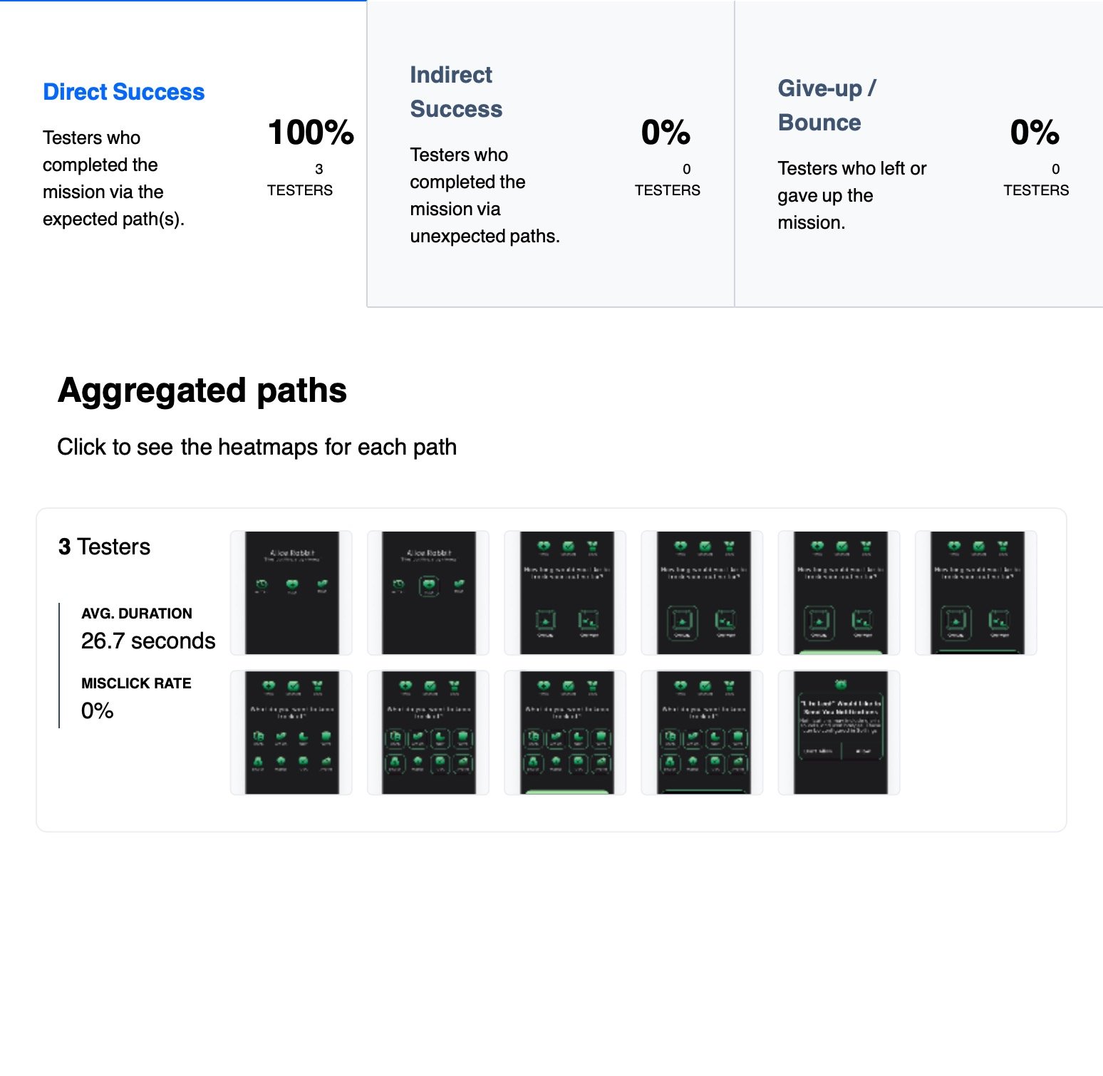
The Solution
After completing my final high fidelity prototype flows, I used Maze to gather unmoderated quantitative data. For the qualitative data and insight, I re-interviewed participants with the final prototype.
The features that users felt would be most relevant centered around their physical and mental well-being on a day-to-day basis. By allowing them to customize their daily expectations and goals, the app is found to be much more inclusive to patients than others available currently.
By crafting a simple and easy flow of interaction, the users are able to receive all of their needed information without cluttering the screen or overloading the users with too many options. This way they can make informed decisions on their health choices and see the direct outcome of those choices.
Further Development
At a later stage in the development, I would like to implement a few additional features.
Based on the early research and competitive analysis, many users wanted a community page to connect with other patients near them. This feature would create a system of support and mutual encouragement for the patients, as well as engage new users to utilize the app.
The custom animated plant progression was a bit of an overreach at this time in the design sprint. I fully plan to bench this concept and iterate on it in later development stages when I have more time to spend in Adobe After Effects.
The Final Conclusion
In this project, I wanted to combine my love for self-care and health maintenance into one app. I identified a problem that has yet to be solved in a new market.
I experimented with many different iterations of designs, colors, and structures in order to come up with the most functional and interesting product, while remaining intuitive to patients. I expanded my knowledge and skills in design software such as Figma and Adobe XD. I improved layouts for IOS-focused viewports greatly compared to my first app.
My biggest doubt was my ability to exhibit the information and interactions needed in a simple and minimal set of actions. When it came to the Profile layout, I was unsure if the options should remain autogenerated or if I should enable the ability to customize the options based on each user’s divergent needs.
A key factor to a successful product is understanding the audience and gathering extensive research data from that audience. Before designing digitally I worked with pen and paper, allowing a loose and quick flow of ideas for the next phases. Even as robust as an app like this could be, I forced myself not to stray from the original minimum viable product requirements laid out in the beginning stages.
The new patient onboarding is easy to understand and efficient to the user. The daily or weekly tracking log can be easily activated and enabled for reminders based on the patients’ goals. I utilized informational forms and visual indicators to keep the complex design minimal.
I learned that while every user has completely individual needs and motivations, all users will need to input, monitor, and access their information in a similar manner. The flow of information must be comprehensible and easy for the user to navigate, whether they have a prevalent understanding of medical and mental health.
In the future, I plan to work in the Adobe Suite rather than Figma to diversify my skillset further.
“Experiential docet.”
— Experience teaches