B4Bus Transit App
An easy and efficient way for riders to locate their bus and save their transportation information.
For my first UX project, I was tasked to create a public transit app that would serve a fictional Midwestern city. This city has a very robust bus transit system that riders have trouble navigating.
Riders reported that it’s difficult to locate their bus when multiple buses are arriving at the same stop at the same time. The riders need to know when their bus is arriving. They need to know how much time they have to be at the bus stop. They need to know the schedule for the bus lines.
Dream.
A public transportation app to serve an urban city.
Define.
Who are the users of public transportation? What are their needs and desires?
Develop.
How is the functionality of the app? How does it work?
Deliver.
A public transportation app to serve the riders in an urban city.
The Overview
The Team
I worked as a solo designer on this project.
The Roles
User Research
UX Design
UI Design
Prototyping
Usability Testing
The Tools
Figma
Adobe Suite
Google Suite
Canva
The Project Requirements
Craft a simple and intuitive transportation app that services thousands of users in the urban Midwest.
Bus riders need to have access to all the scheduled times for each bus route.
Bus riders can easily and efficiently determine when their bus is arriving at the stop.
Bus riders can easily and accurately calulate how much time they have to get to the bus stop.
Phase One - The Research
Being based in New York City, I was able to reach out within my community for research purposes. Many of the people I know here are users of the city’s public transportation system. Over the course of 4 weeks, I researched real users and gathered the data to determine the most efficient design for the bus app.
Competitive Analysis
I took a moment to research and analyze the competing transportation apps available. I identified their strengths and weaknesses with a SWOT chart.
Google Maps
strengths: accurate, real- time updates, alerts for route progress, saves previous route information
weakness: issues with accessibility of colors used
MTA Transit
strengths: ability to view all scheduled times, purchase tickets on mobile device, multiple options available
weakness: inaccurate times or numbers, non-intuitive app
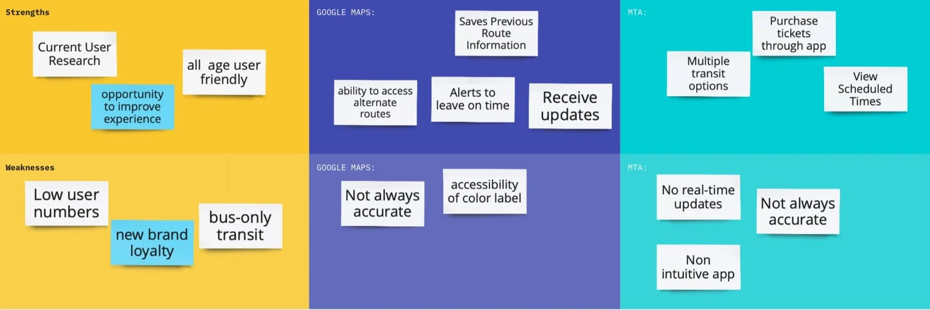
Analysis of Google Maps and MTA Transit
The Survey
I created and conducted surveys with real bus riders to gain insight into their routines, demographics, and goals.
Would real-time notifications be helpful?
How do you check the public transit schedule?
What features would you like to see on a transportation app?
Alerts of Delays and Arrivals were ranked the highest in importance to riders.
High to Low Priority Features
The Interview
I followed up my surveys with interviews to further glean information about their experience with public transit. I interviewed 3 riders of the bus to map out patterns in their routines, motivations, and pain points.
Key User Insights
Real-time updates of bus location, maintenance, delays, and arrivals are helpful features to users. This makes it easy for the rider to plan their day and be on time.
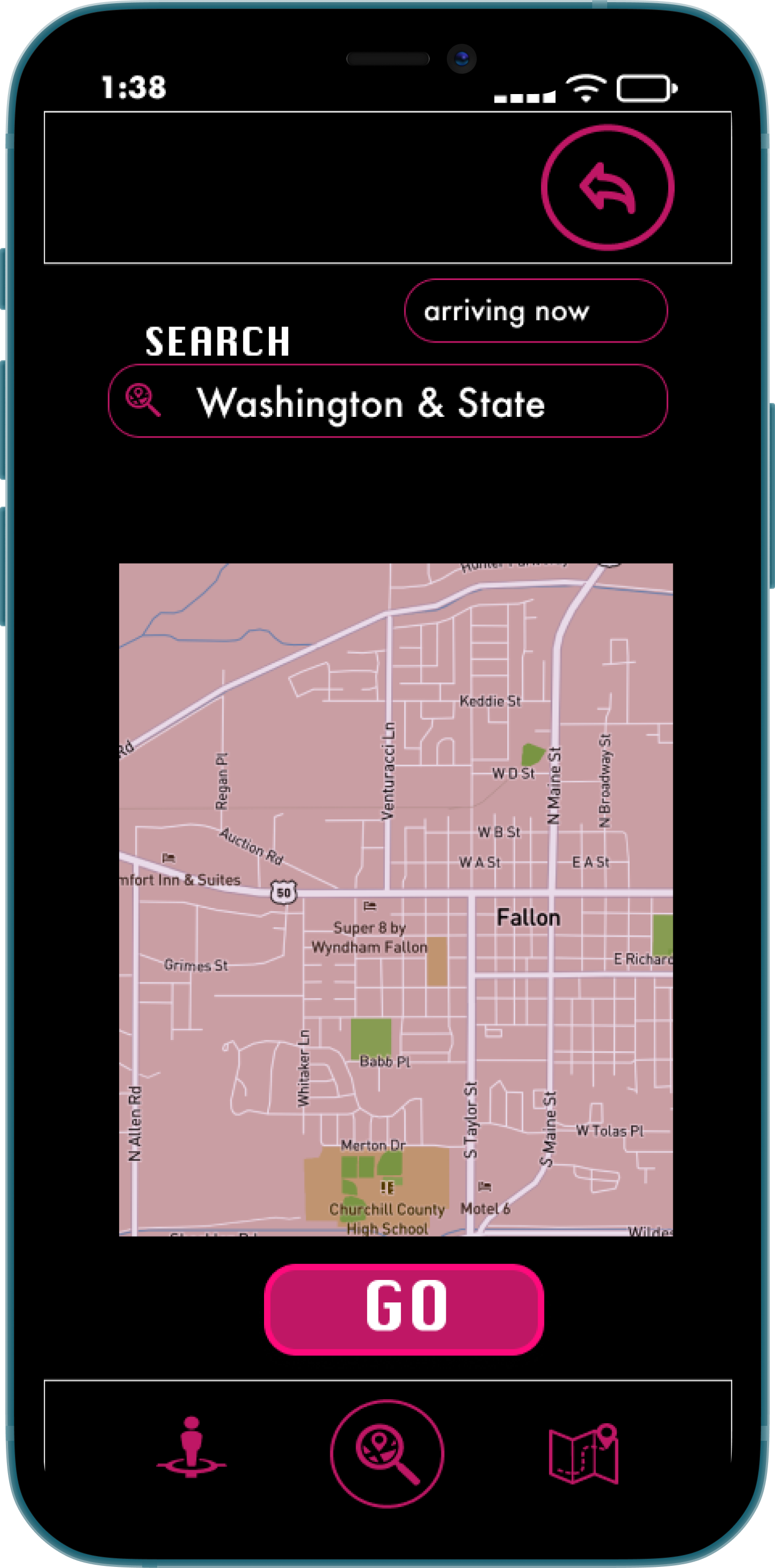
The most useful feature to riders is the access to the bus schedules for all seven lines, clearly displaying the bus arrivals for each stop.
Accurate, real-time updates of delays and maintenance will ensure that riders can choose the best route for their schedules.
By implementing these insights, we will give riders a better understanding of when to arrive at what bus stop for their bus.
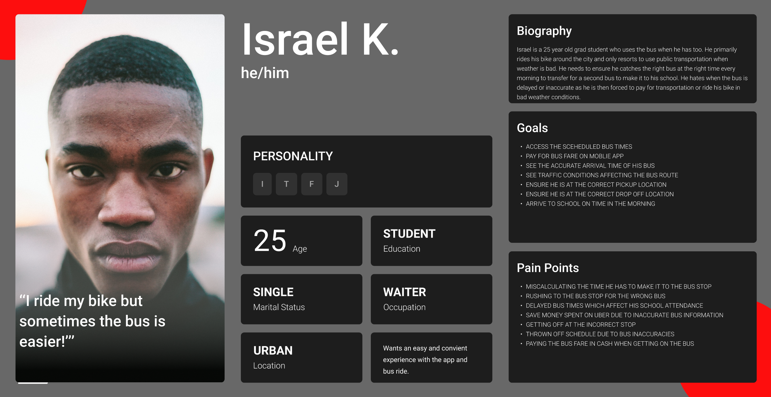
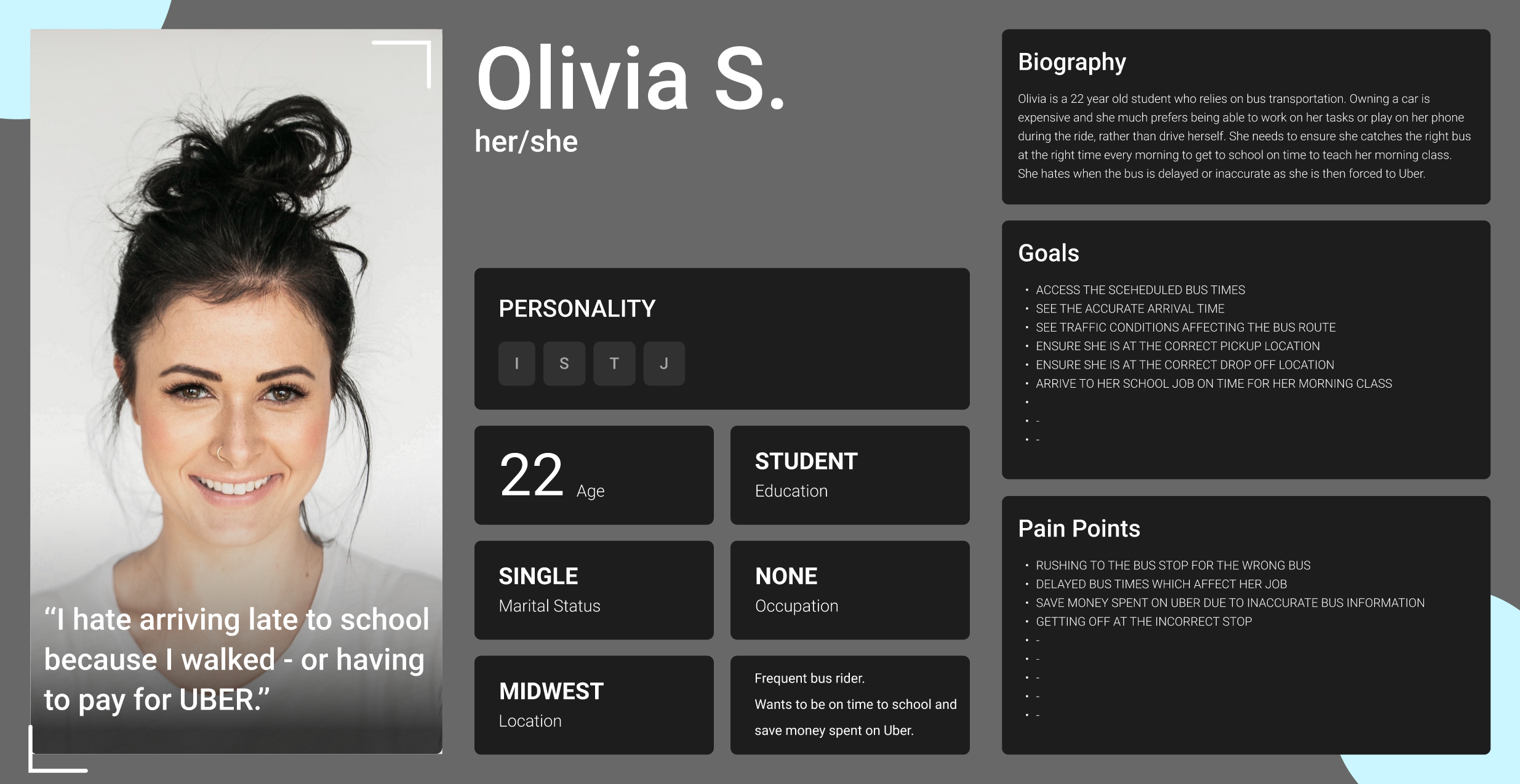
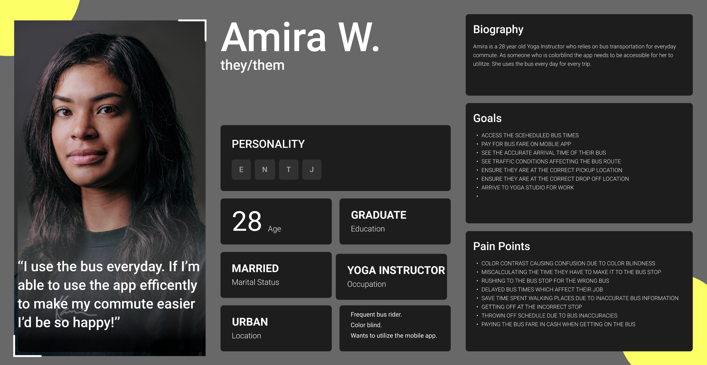
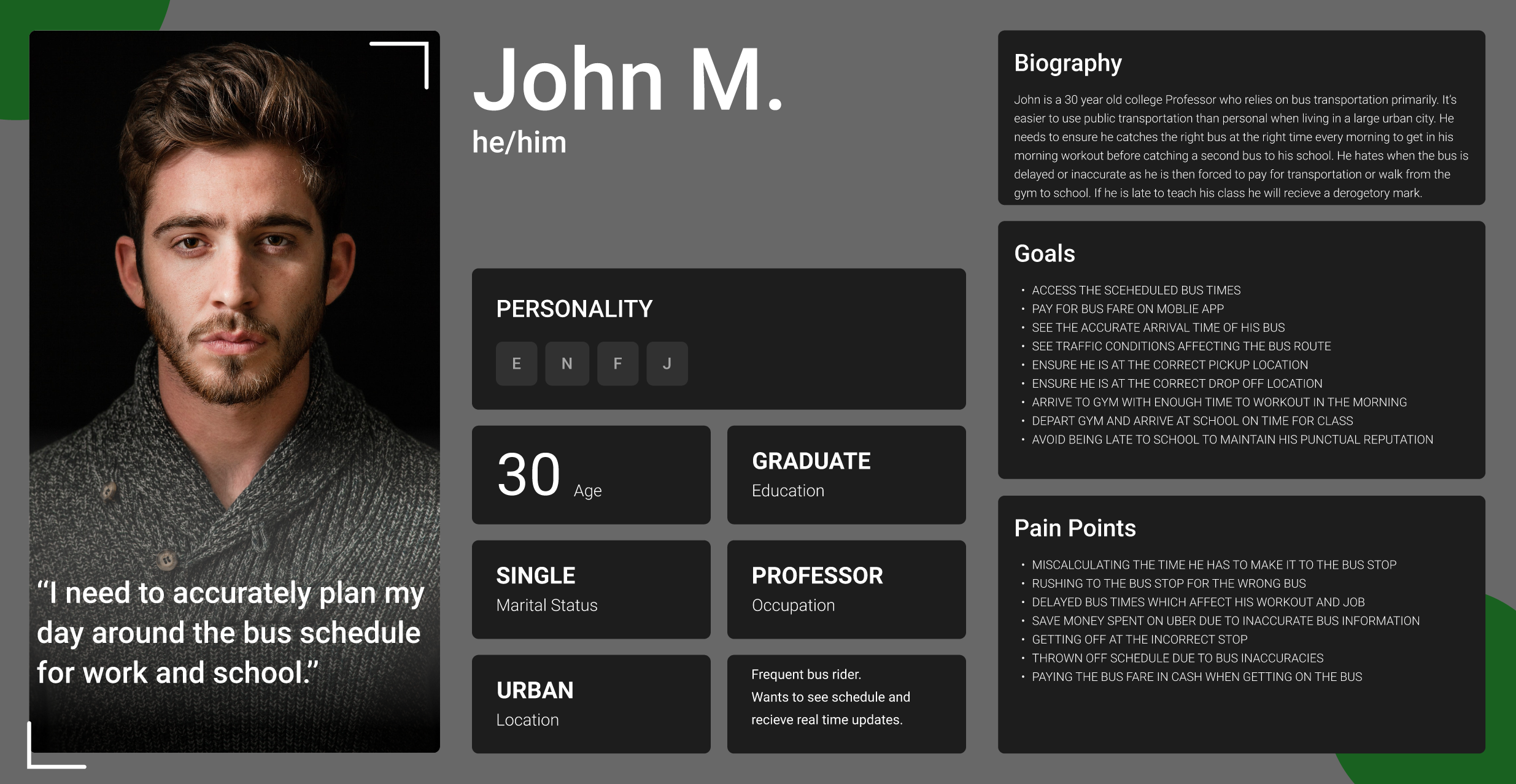
Personas
Based on the gathered data, I created four Personas to map out the motivations and obstacles of our riders and identify opportunities for improvement.
Phase Two - The Design
After completing my research into the targeted audience, I compiled that data with the data that was given to me in order to determine the necessary functions the users would need from the app. I organized those functions from highest to lowest priority.
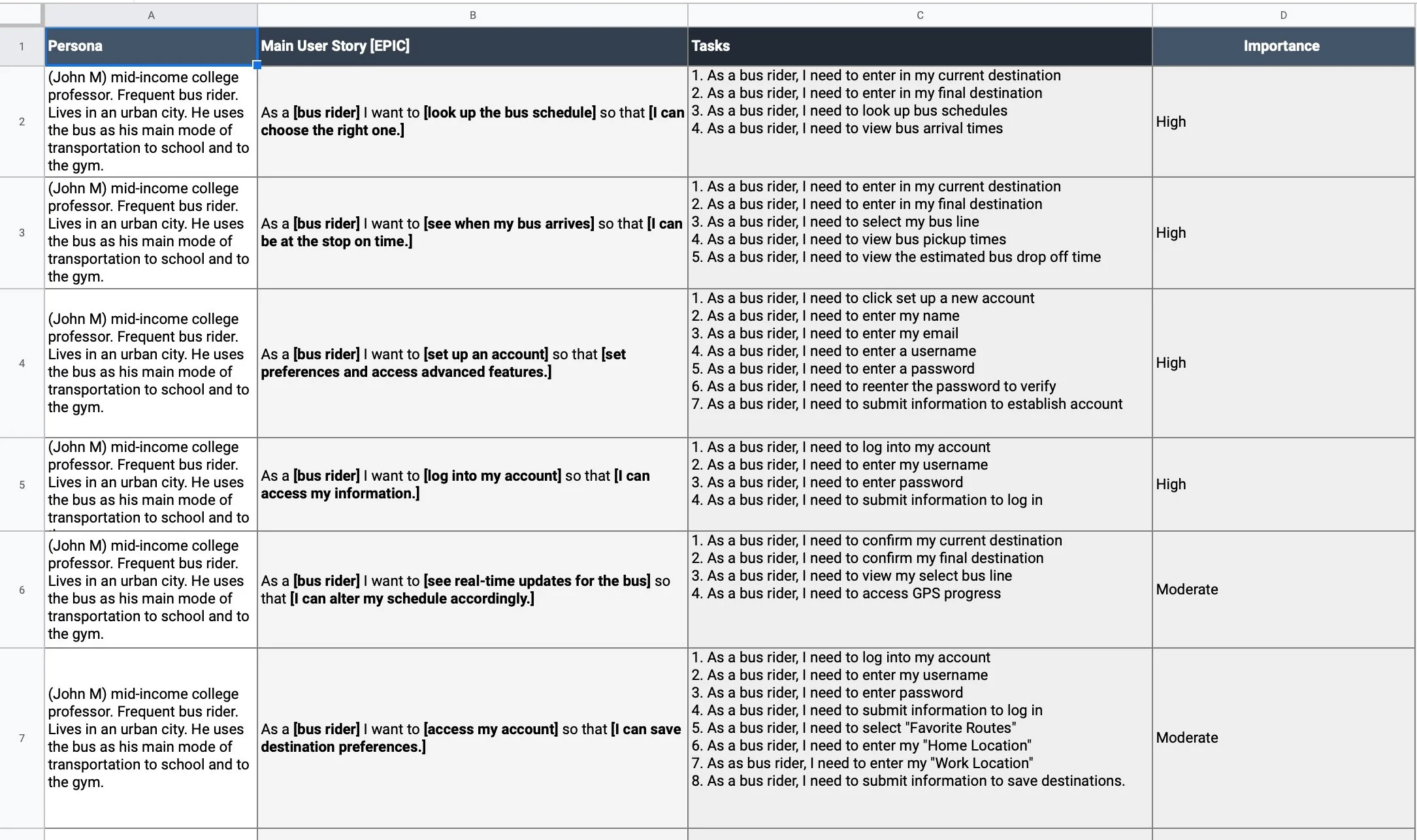
User Stories
I indentified the main Epics and organized them by importance.
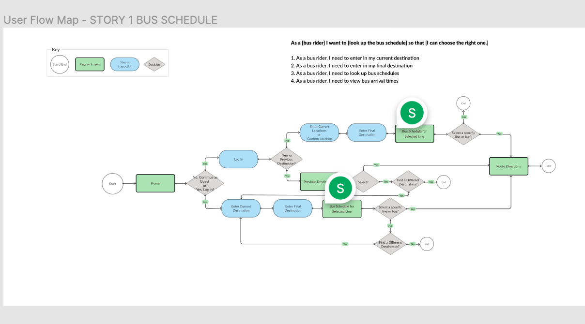
User Flows
I used the stories to begin to draft and iterate on the flows of the app.
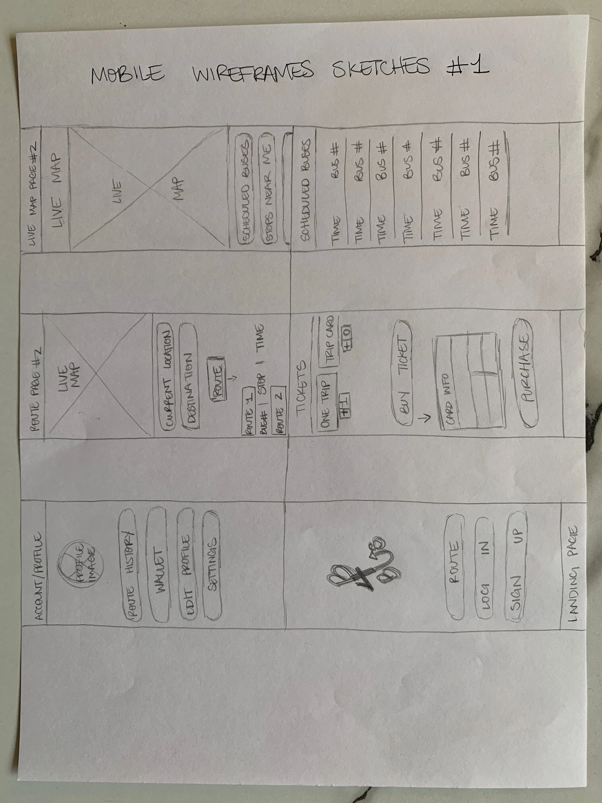
Sketches
I sketched out multiple options for screen layouts.
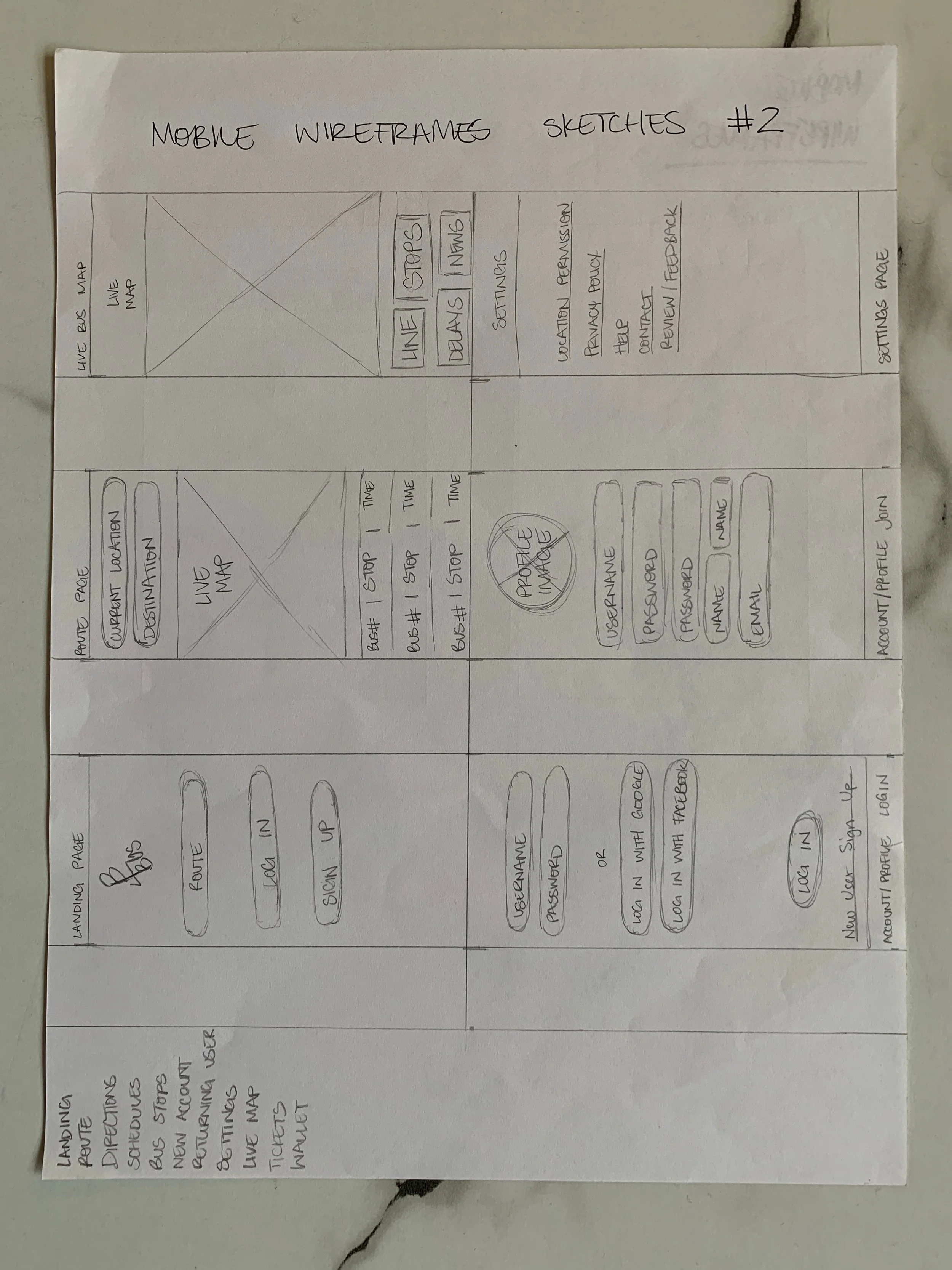
Wireframe sketches
Wireframes
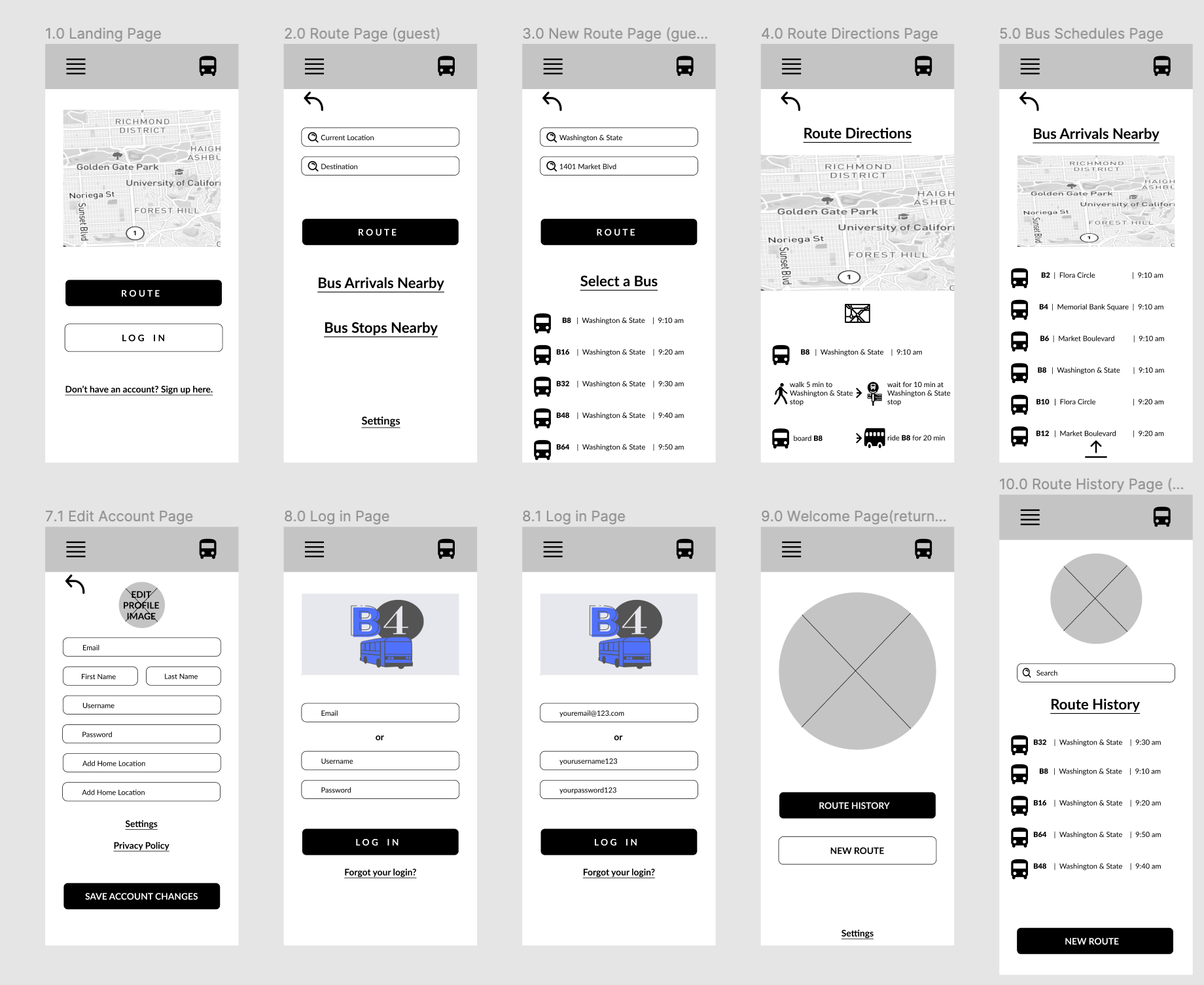
After working with the design possibilities on paper, I moved to a digital workspace. With tools such as Figma, I started building the screens needed for the MVP.
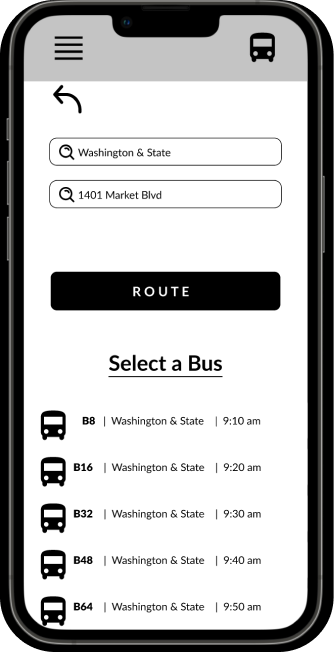
First iteration Search Route page
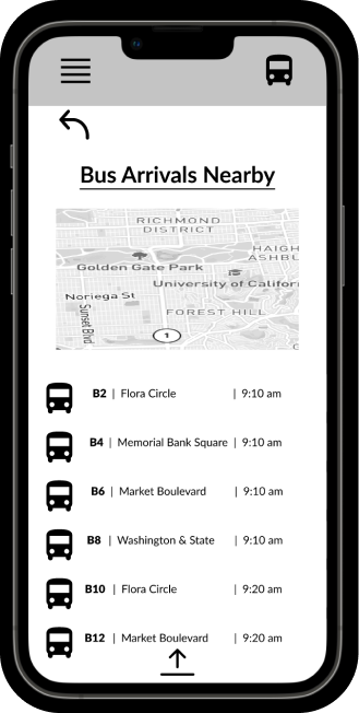
First iteration Arrivals Nearby page
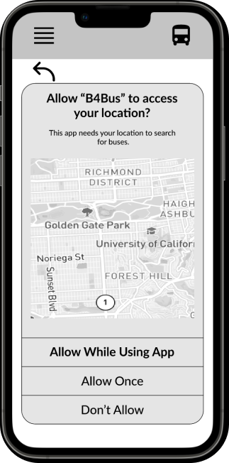
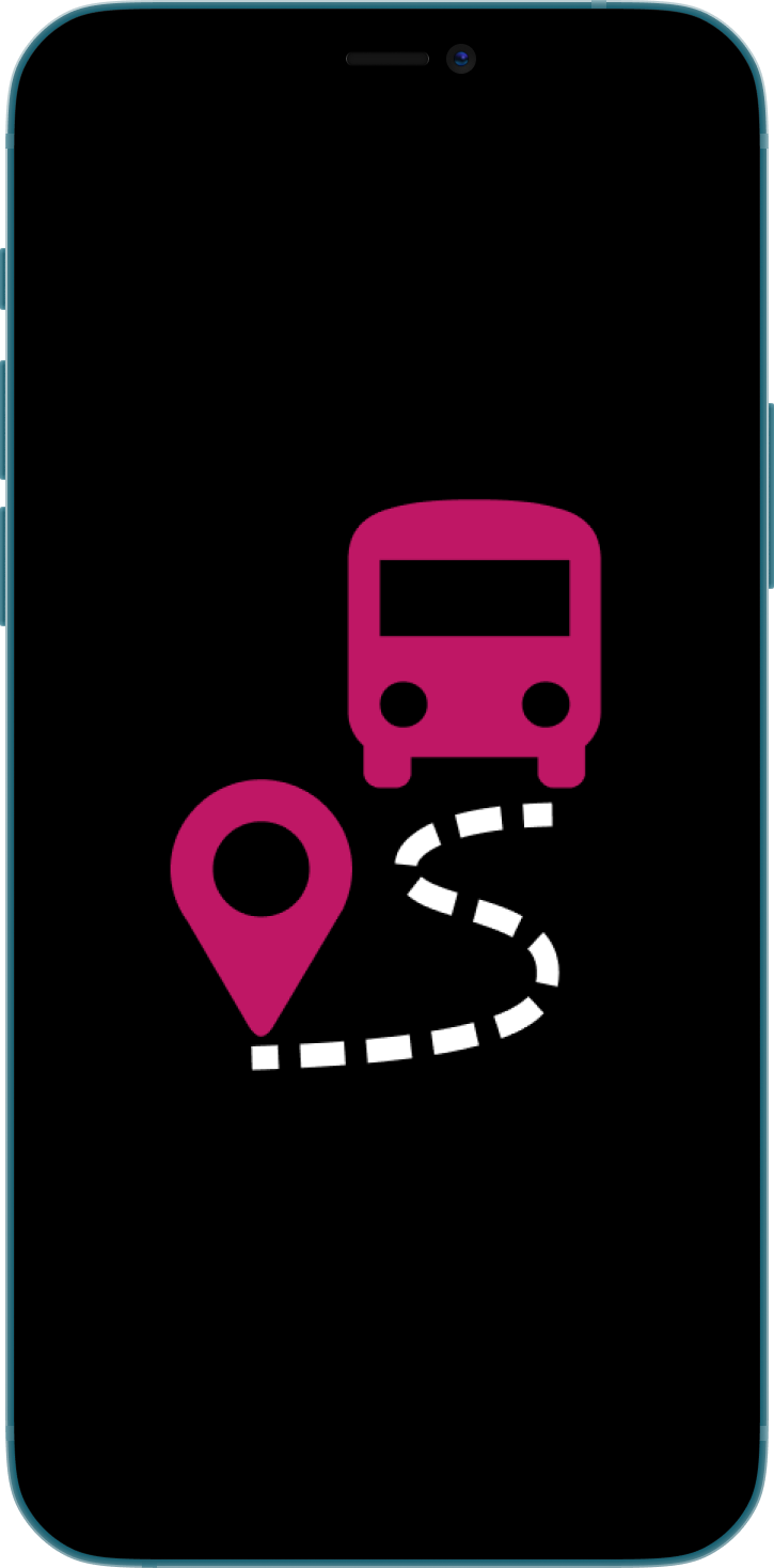
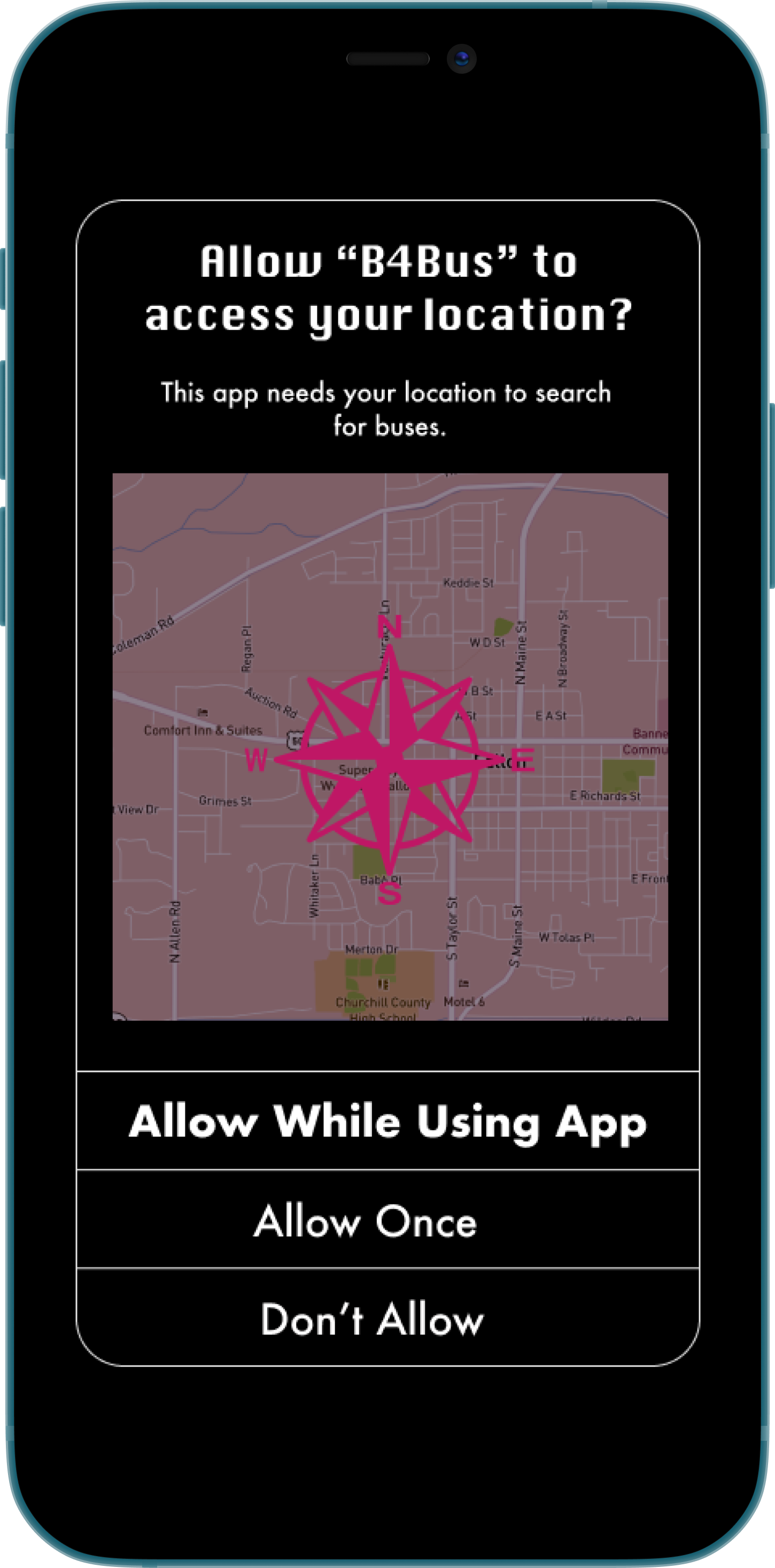
First iteration Location Permissions page
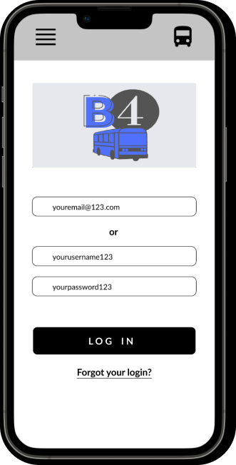
First iteration Log In page
The Brand
After the completion of testing I shifted my focus to the brand.
First iteration style tile
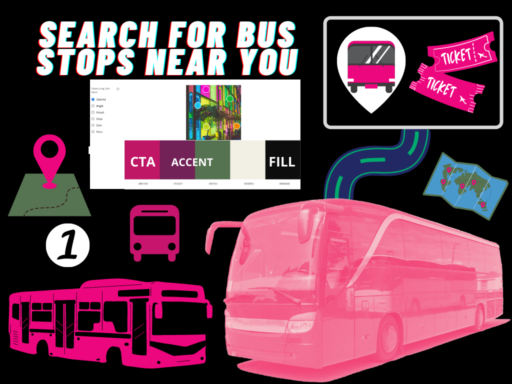
Second iteration style tile
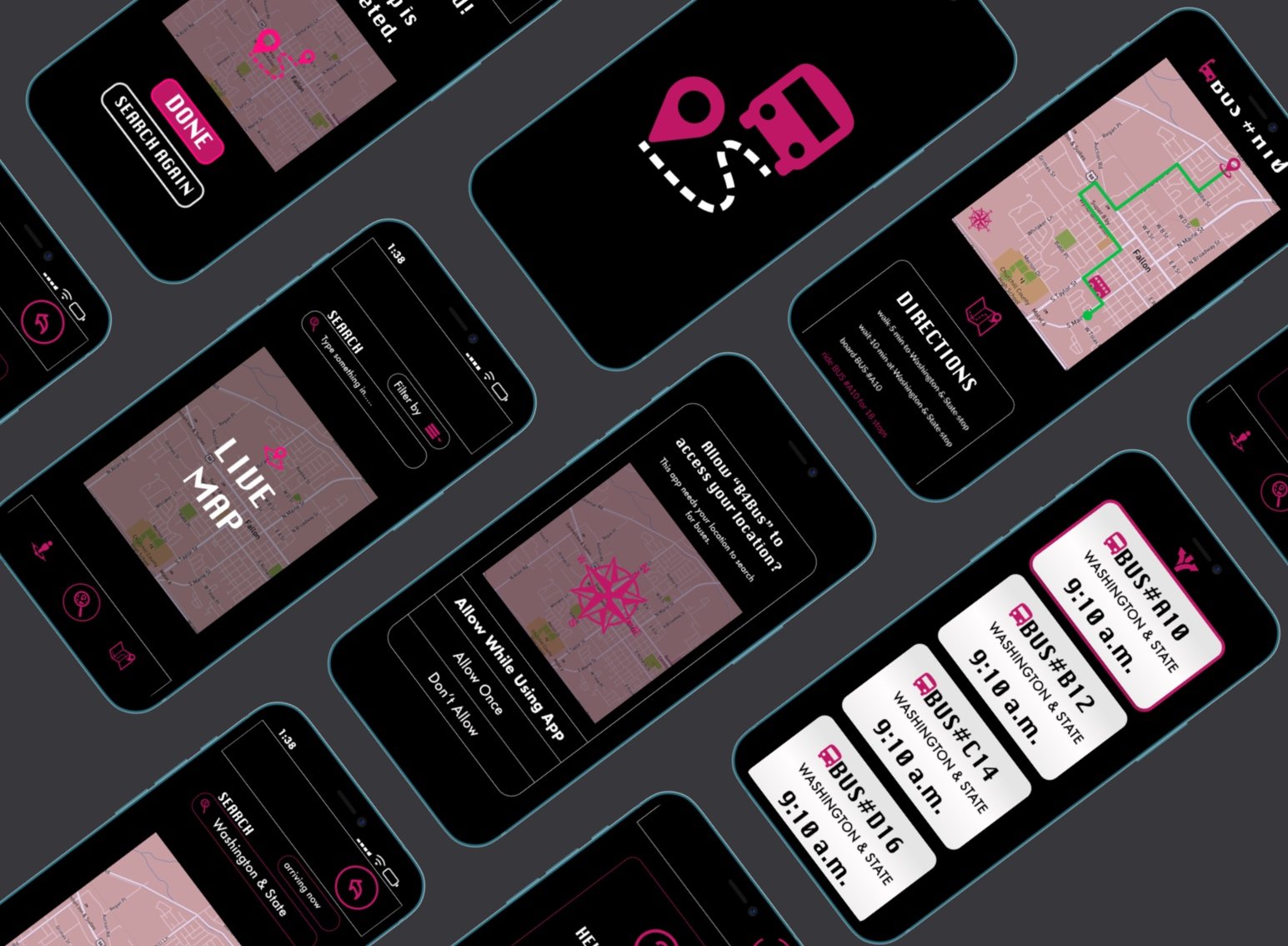
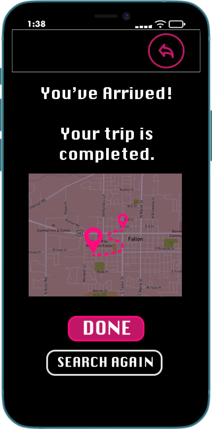
High-Fidelity Mockups
The next step was to take the branding details and create the high-fidelity mockups that would be used for final testing.
The Usability Test
I sent out my first iteration clickable prototype to friends and family to give me an initial reaction and feedback. By having them complete a series of actions or tasks under observation, I was able to adjust the design to ensure optimal efficiency and ease to the users.
The Outcomes
Reiteration
After receiving 3 suggestions for improvement of the call to action buttons I decided to redesign the landing page alignment for the buttons. I chose to prioritize the most searched for options within the first screen. This improved the navigation of the app.
Results
Users reported that the app is straightforward and necessary information is found easily. The call to action is clear. The branding is unique and interesting but still accessible.
“I like how quickly I was able to find my bus route information!”
— JOHN, daily bus rider
“The notifications about arrivals and departures would be a lifesaver!”
— AMIRA, frequent bus rider
The Solution
The most useful feature to riders is the access to the bus schedules for all seven lines, clearly displaying the bus arrivals for each stop. This will give them a better understanding of *when* to arrive at *what* bus stop for their bus.
The features that users would like implemented focus mainly on the relay of bus information. The difficulty in locating the correct bus time and correct bus number greatly impacts the rider's daily tasks and experience.
By laying out a simple and easy flow of interaction, we’re able to give users all of their needed information without cluttering the screen or overloading the users with too many options.
Further Development
At a later stage in the app, I would like to implement a few additional features.
Based on the early research, many users wanted to be able to pay for their tickets from the mobile app. This feature would speed up boarding times, as well as allow bus drivers to no longer handle the transactions.
The Final Conclusion
As this was my first UX project, I wanted to complete as many roles of research and deliverables as I could. Gaining as much experience as possible was the main goal of this project and I believe I did exactly that. Understanding the research behind the design is absolutely essential, I took the time to analyze the users and gather extensive data. Before working digitally I worked with pen and paper, allowing a loose and quick flow of ideas for the next phases. I expanded through the digital visual design process and stretched my design thinking muscles. Even as robust as an app like this could be, I forced myself not to stray from the original minimum viable product requirements laid out in the beginning stages.
In this project, I explored many different iterations and reiterations of designs, colors, and structures in order to come up with the most functional and interesting outcome, while remaining simple to users. I learned a lot about matching mental models and also designing in tools such as Figma, for either IOS or Android viewports.
When I work on my next project, my knowledge from this thorough public transportation app will provide a sound base for growth in all of my UX and Visual Design skills.
“Experiential docet.”
— Experience teaches